10 Best Free Icon Sets for Your Design Projects

If you’re a web developer or designer, chances are there are few things you love more than a good set of freebies. Free graphics are hardly hard to come by, but quality free brackets aren’t quite as common as you might hope. Luckily for you, we’ve curated this versatile list of free icon sets that will add dimension, color, and flair to any of your websites and designs. Keep reading to see if any of these sets might be right for you or one of your projects.

1. Free Shopping Cart Icons

Screen Shot 2017-02-08 at 1.32.25 PM

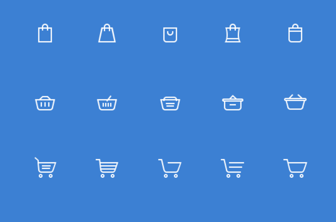
This collection of shopping related icons is perfect if you’re working on a retail or ecommerce project. The set comes with Add to Cart buttons, shopping cart icons, shopping bag icons, and some small shopping basket graphics. Definitely a good set to have in your arsenal, even if you don’t currently have an ecommerce project going on.

2. Calendar Icons Set

Screen Shot 2017-02-08 at 1.36.55 PM

This icon set features 8 different calendar designs that come as PSDs with organized layers, making it easy to customize dates and colors to reflect the needs of your individual projects.

3. 100 Kitchen Icons

Screen Shot 2017-02-08 at 2.41.09 PM

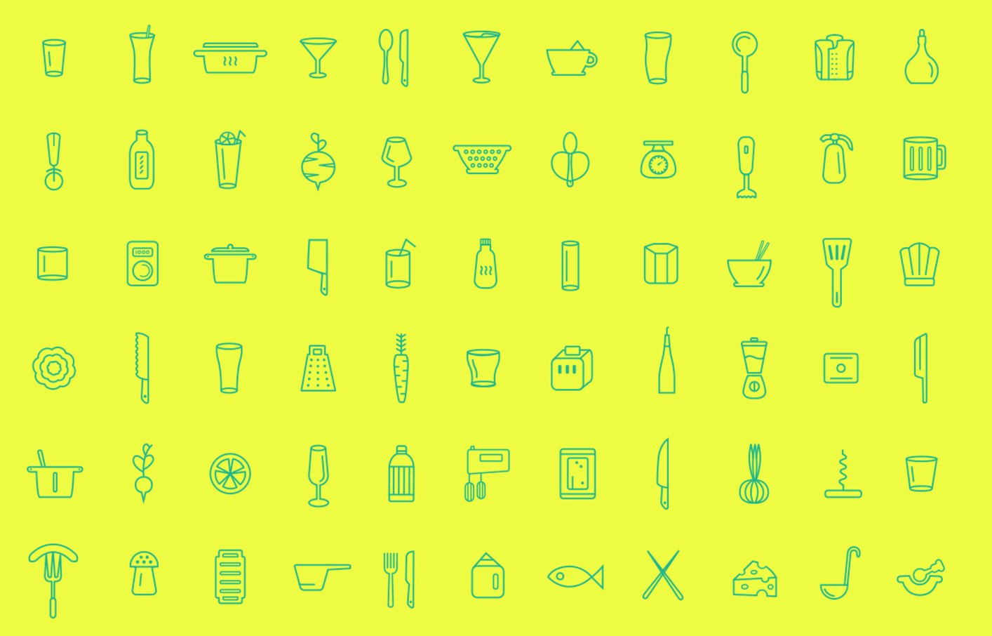
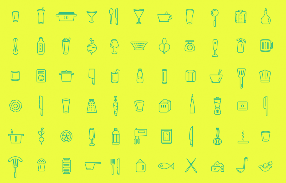
Perfect for any projects having to do with restaurants or the culinary world. Some of the icons included in this set are ones that you certainly wouldn’t find in a generic or all-purpose collection, including corkscrews, rolling pins, juicers, whisks, and strainers.

4. New York Building Icons Set

Screen Shot 2017-02-08 at 2.50.41 PM

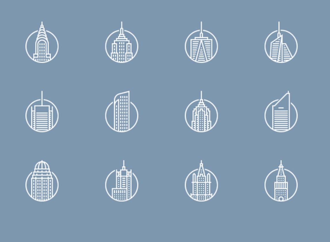
Inspired by the buildings of New York City, most of these simple icons could easily represent buildings or skyscrapers belonging to any urban city. A very professional looking set.

5. Fileicons

Screen Shot 2017-02-08 at 2.58.54 PM

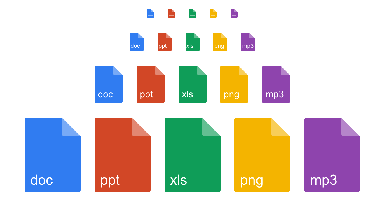
This colorful set of icons that represent various files with different extensions is very useful for any web developer to have on hand. The files come in several different sizes for all of your possible icon needs.

6. One-line Startup Icons

Screen Shot 2017-02-08 at 3.00.12 PM

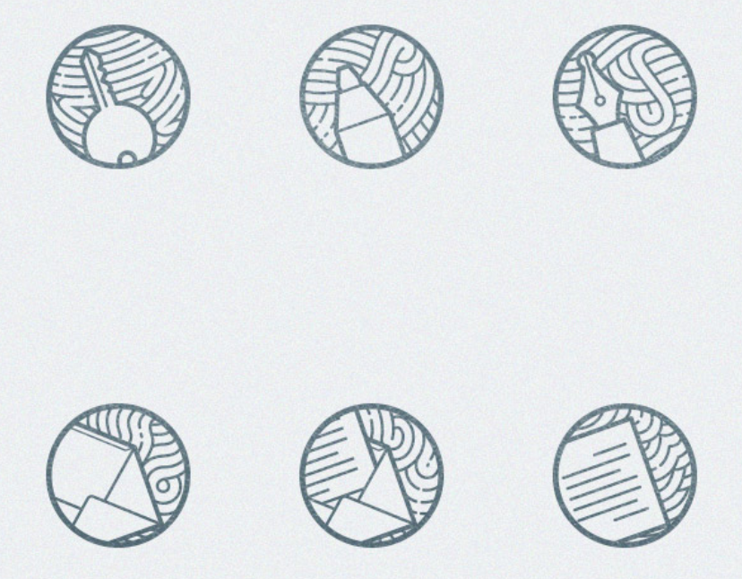
An icon set inspired by startup (and, dare we say, hipster?) culture. The cool thing about this set (besides the Darth Vader icon), is that they were all drawn using one loopy line, which adds a cool variation to the startup theme.

7. Zen Icons

Screen Shot 2017-02-08 at 3.02.00 PM

With only 12 icons included in this set, the collection isn’t quite as useful or versatile as others on this list. But what it lacks in practicality, it makes up for in beauty. The intricate details are what make these icons unique. Perfect to use in a portfolio site or something similar.

8. Flat Social Icons

Screen Shot 2017-02-08 at 3.06.10 PM

This basic set of flat social media icons is perfect for linking to any social media presence. Colors and shapes are totally customizable.

9. Flat Business Vector Icons

Screen Shot 2017-02-08 at 3.08.06 PM

This set of business-related icons can be used in many different types of projects for professional businesses. As a designer or developer, you can’t go wrong by having these in your personal icon collection.

10. Flat Line Icons

Screen Shot 2017-02-08 at 3.09.59 PM

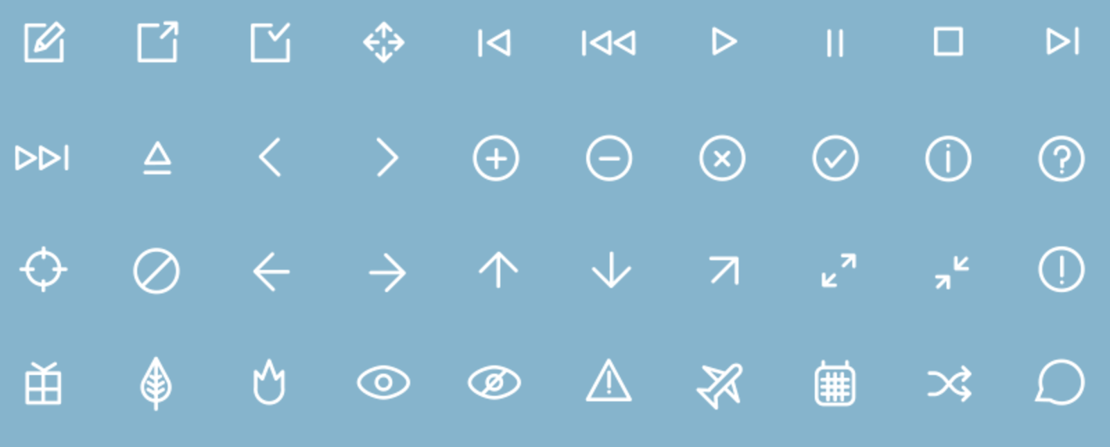
If you’re looking for a generic, versatile icon set, this is a great option. It includes all the basic icons a developer might need — arrows, play buttons, envelopes, music notes, pencils, etc, all in a simple, modern aesthetic.

Creating a Window Text Effect with CSS

One of the best things about CSS is that it gives developers the tools to create things that normally would have to be created with photo editing or illustrator software. One of the coolest effects you can achieve using only CSS is the versatile and super simple window text effect. This is an effect you can add to your projects as a header, a logo, a hover state…the possibilities are endless. And the best part is, it’s relatively easy to achieve from scratch.

To start, you’re going to need to pick a cool image or color that you want to use as the background for your page/container. Then we’ll begin with the HTML.

The HTML

The only HTML for this effect that’s absolutely essential is a div tag and a text tag (the bigger the better, so we used an h1 tag) somewhere within that div:

<div class="container">
<h1 class="window">COOL TEXT</h1>
</div>

The CSS

This effect is achieved entirely using CSS code. First, we’re going to import a font (we’re using Droid Sans, but feel free to experiment with your own font-family), assign that font-family to the HTML, and set up the cool image that we chose as the background of our container div:

body{
font-family: ‘Droid Sans’, sans-serif;
}

.container{
background: url(../sky.jpg);
background-size: cover;
}

That’s the easy part. Now it’s time to style the h1 tag. To style our h1, we’ll want to position it on the page using the left, top, and transform properties, change the positioning to position: absolute to ensure that all of the text remains positioned on the page once we apply the window effect, and set a large font-size and line-height property so that the effect is visible. It’s also very important that the background of the h2 tag is a dark color (we used #222) and that the color of the text is white (#fff).

h1.window{
 position: absolute;
 top: 30%;
 left: 50%;
 transform: translate(-50%, -50%);
 font-size: 100px;
 line-height: 80px;
 text-align: center;
 padding: 30px;
 color: #fff;
 cursor: pointer;
 background: #222;
}

The result of the above CSS will leave you with a result looking like this:

Screen Shot 2016-11-14 at 4.19.16 PM

As you can see, the “window” effect hasn’t been applied to the text yet, because the text is white and opaque. To make the text transparent, you’ll only need one more line of CSS: the mix-blend-mode property. The mix-blend-mode property defines how an element’s content should blend with the background. When you apply it to light text on a dark background, the text will become see-through. Here is the final line you’ll need to add to the h1’s style:

h1.window{
  mix-blend-mode: multiply;
}

Your final result should now look like this:

Screen Shot 2016-11-14 at 4.18.44 PM

Customize the code in this tutorial by adding your own text, images, colors, etc. Get creative and be sure to include this effect in one of your next projects!

The Ten Best Star Wars CSS Snippets

In honor of Rogue One‘s recent release, we’ve compiled a list of our favorite (and the very best) Star Wars related CSS code snippets around. These snippets are yours to use, customize, or add to any of your space-themed projects.

1. Pure CSS Star Wars Lightsaber Checkboxes

Screen Shot 2016-12-28 at 8.39.18 AM

This pure CSS snippet creates the lightsabers of everyone’s favorite Star Wars characters — Luke, Vader, Yoda, and Obi Wan. They’re created by adding a lot of different styling techniques to checkbox input fields, so that the lightsabers’ beam toggles when you click on the any of the handles.

2. Star Wars Opening Crawl from 1977

Screen Shot 2016-12-28 at 8.44.27 AM

This tutorial demonstrates how to make a completely accurate version of the opening scene text crawl from the original Star Wars films. Complete with audio!

3. Pure CSS Storm Trooper

Screen Shot 2016-12-28 at 8.45.52 AM

Create a realistic storm trooper helmet using only CSS with this CodePen tutorial.

4. AT-AT Walker

Screen Shot 2016-12-28 at 8.47.21 AM

This snippet creates a detailed, animated AT-AT that walks and shoots lasers.

5. BB-8

Screen Shot 2016-12-28 at 8.49.42 AM

This snippet creates a CSS version of everyone’s favorite new droid, BB-8. BB-8 responds to mouse movements and will actually move left to right depending on which way you point your mouse.

6. Pure CSS Princess Leia

Screen Shot 2016-12-28 at 8.51.28 AM

Create a CSS rendering of Princess Leia and her iconic space buns using this code snippet.

7. Star Wars Menu Icon

Screen Shot 2016-12-28 at 8.52.45 AM

This snippet is a really interesting take on the traditional “hamburger” menu icon — instead of three boring lines, the lines of the menu icon are actually lightsabers that light up when they’re hovered upon and animate when clicked.

8. Pure CSS R2-D2

Screen Shot 2016-12-28 at 8.56.33 AM

Create an incredibly accurate pure CSS R2-D2 using this code snippet.

9. 3D Death Star

Screen Shot 2016-12-28 at 8.57.35 AM

Use this code snippet to create a 3D Death Star that spins in space.

10. HTML5 Canvas X-Wing Animation

Screen Shot 2016-12-28 at 8.59.37 AM

The x-wing plane in this code snippet is speeding past mountains and canyons just like it might in the Star Wars films.

How to Create a Fixed Header

Fixed headers are an increasingly popular trend for styling headers or navigation menus on your site. When you add a fixed header to a page, that means that the position of the header stays fixed (usually to the top of the page, but it doesn’t necessarily have to be positioned as such) no matter how far the user scrolls down the page. This feature is helpful for anyone who wants to make sure their users always have access to particular links or navigation no matter which part of the page they may be exploring.

If you think that adding a fixed header to any of your projects might be a good idea or, at the very least, a fun experiment, you’re in luck, because it’s actually pretty easy to do. Keep reading and we’ll walk you through the basic steps.

The HTML

For a very, very basic fixed header structure, we used something like this:

<body>

<div class="header">
 <h1 class="header_logo">This is a Fixed Header</h1>
</div>
<div class="offset">
 <p>Scroll down to see the responsive header in action.</p>
</div>

</body>

It’s totally up to you what you want to include in your header. It could be navigation, links, a phone number or other contact info…the choice is completely yours. For the purposes of this demonstration, we just chose to include some text indicating that what you’re looking at is, in fact, a fixed header, and some content below that so we have something to scroll past.

The CSS

We wanted our fixed header to be purple, but the color choice and style of your header is totally up to you. The only line of CSS you absolutely can’t do without if you want the header to be fixed is position: fixed, which in our code is applied to the .header selector. The size, color, positioning, padding, font-family, and pretty much everything else can be tailored to the needs of your project or site.

Check out the CSS below:

body {
 height: 1500px;
 font-family: "Montserrat";
}

.offset {
 margin-top: 0;
 padding-top: 270px;
 text-align: center;
 -webkit-transition: .3s;
 transition: .3s;
}

.header {
 position: fixed;
 width: 100%;
 height: 100px;
 font-weight: bold;
 text-align: center;
 background: #7F6FF0;
 -webkit-transition: .3s;
 transition: .3s;
 color: #fff;
}

.header_logo {
 font-family: 'Oswald', sans-serif;
 margin: 0;
 padding-top: 8px;
 font-size: 30px;
 text-shadow: 3px 4px rgba(0, 0, 0, 0.1);
 -webkit-transition: .3s;
 transition: .3s;
}

If you use the code above, this is how your fixed header should look:

Screen Shot 2016-12-20 at 8.53.55 AM

While you can’t really appreciate the whole fixed header effect from just a screenshot, trust us when we say that when you scroll down this page , you will scroll past the text and end up with the header still stuck to the to of the page. Add the code to any of your projects to see it in action for yourself!

CSS Snippets: Styling Breadcrumbs

In the famous old story of Hansel and Gretel, the children spread breadcrumbs behind them as they made their way into the woods. They left this trail of breadcrumbs so that they would always be able to find their way home. In web development, breadcrumbs are a navigational element that, much like Hansel and Gretel’s breadcrumbs, show you the path you took to get to the page you’re currently visiting, and allow you to retrace your steps, if you like. This helpful navigational element was actually named for the breadcrumbs in the old fairy tale.

While breadcrumbs are certainly a useful feature to add to any project, they’re often overlooked when it comes to adding style. Most of the time, they’re treated just like any other link in terms of style. If you want to add some flair to your breadcrumbs, check out the snippet below.

The HTML

Here’s the easy part. For the purposes of this example, we’ll just use static HTML to create our breadcrumbs, which will be <li> elements within a <ul> tag.

<ul id="breadcrumb">
 <li><a href="#"><i class="fa fa-home"></i></a></li>
 <li><a href="#">Crumb 1</a></li>
 <li><a href="#">Crumb 2</a></li>
 <li><a href="#">Crumb 3</a></li>
 <li><a href="#">Crumb 4</a></li>
 </ul>

Here’s how it looks so far:

Screen Shot 2016-12-13 at 5.23.21 PM

As you might be able to tell, we used a Font Awesome icon to indicate the home page. If you plan on using Font Awesome too, make sure you link to their library somewhere in the <head> section of your code. Here’s the link to their library:

<link rel="stylesheet" href="https://maxcdn.bootstrapcdn.com/font-awesome/4.5.0/css/font-awesome.min.css">

The CSS

In the CSS, we’re going to give the breadcrumbs a nice arrow shape. This effect is achieved by utilizing the :before and :after pseudo-selectors (if you take a look at the code, you’ll see that all of the shaping of the breadcrumbs happens within the #breadcrumb li a:before and #breadcrumb li a:after selectors. If you’re interested in learning how to achieve that shaping, pay special attention to the uses of border and border-color within those selectors).

@import url(https://fonts.googleapis.com/css?family=Source+Sans+Pro:400,700);

body{
 font-family: 'Source Sans Pro';
 background-color: #d6fffb;
}

#breadcrumb{
 list-style-type: none;
 display: inline-block;
}

#breadcrumb li{
 float: left;
}

#breadcrumb li a{
 color: #fff;
 display: block;
 background: #f40c81;
 text-decoration: none;
 position: relative;
 height: 40px;
 line-height: 40px;
 padding: 0 10px 0 5px;
 text-align: center;
 margin-right: 23px;
}

#breadcrumb li:nth-child(even) a:before{
 border-left-color: transparent;
}

#breadcrumb li:first-child a{
 padding-left: 15px;
 border-radius: 4px 0 0 4px;
}

#breadcrumb li:first-child a:before{
 border: none;
}

#breadcrumb li:last-child a{
 padding-right: 15px;
 border-radius: 0 4px 4px 0;
}

#breadcrumb li:last-child a:after{
 border: none;
}

#breadcrumb li a:before, #breadcrumb li a:after{
 content: "";
 position: absolute;
 top: 0;
 border: 0 solid #f40c81;
 border-width: 20px 10px;
 width: 0;
 height: 0;
}

#breadcrumb li a:before{
 left: -20px;
 border-left-color: transparent;
}

#breadcrumb li a:after{
 left: 100%;
 border-color: transparent;
 border-left-color: #f40c81;
}

#breadcrumb li a:hover{
 background: #7dd49a;
}

#breadcrumb li a:hover:before{
 border-color: #7dd49a;
 border-left-color: transparent;
}

#breadcrumb li a:hover:after{
 border-left-color: #7dd49a;
}

It’s a lot of CSS, but don’t worry, most of it is rather simple. Here’s what it looks like now:

Screen Shot 2016-12-13 at 5.04.23 PM

Finishing Touches

Let’s add some polish to this design by adding a cool hover effect that changes the background color from pink to green when the breadcrumbs are hovered upon. Because the #breadcrumb li a:before and #breadcrumb li a:after make up part of the background of the breadcrumbs, it’s important to remember to include hover effect style rules for them too, or else your breadcrumbs could end up looking a little funky when a user hovers upon them.

#breadcrumb li a:hover{
 background: #7dd49a;
}

#breadcrumb li a:hover:before{
 border-color: #7dd49a;
 border-left-color: transparent;
}

#breadcrumb li a:hover:after{
 border-left-color: #7dd49a;
}

This is what your finished product should look like (notice that the hover effect is applied to Crumb 4).

Screen Shot 2016-12-13 at 5.04.30 PM

WordPress or Drupal: Which One is Right for You?

WordPress and Drupal are both popular, powerful CMS platforms, and if you’re a web developer, chances are that you’re going to have to work with both of them at some point in your career. Most developers have their own preferences for which one they’d rather work with, and these preferences can sometimes be based on arbitrary things, like which platform you worked with first, or they can be based on more concrete reasoning, like your level of PHP skills.

The truth is, WordPress and Drupal, while both CMS platforms, are similar in the broadest of terms, but it many ways they are very, very different. Neither is better than the other, but each is definitely suited to different types of projects and different types of developers. If you’re not sure which is most suited to you and your project, read our analysis of the two CMS platforms below.

WordPress

The greatest thing about WordPress is that it’s super user-friendly. The install only takes five minutes, and once you have everything set up, you can jump right in using any of the default themes, which are all responsive and feature clean, modern designs. With WordPress, it’s possible for even the most inexperienced developers to get a site up and running in a very short time frame.

If you’re not into any of the default themes, you’re in luck, because there are thousands of free and premium WordPress themes available, both from WordPress’s theme directory and from third parties, so you can make your site look great without the need for a developer or designer.

The other great thing about WordPress are the plugins. There are almost 50,000 free plugins available to add to your site, and they can all be added using your WordPress dashboards, so technically you don’t need to have any coding skills or FTP experience to add the plugins to your server (although it probably helps). Plugins are used primarily to add functionalities to your site, so WordPress is a great CMS option for people who are tech-savvy but not necessarily coders.

WordPress also has a great support community in the form of forums. If you have a question, chances are it has already been asked and answered somewhere in the archive. For all of these reasons, WordPress is the better CMS platform for people who don’t code, or for people who are new to coding. For a lot of developers, WordPress is the first CMS they use, which might explain why so many people have a preference for it, and why it’s a lot more popular than Drupal.

Drupal

WordPress’s user-friendliness is limiting in a lot of ways. Drupal relies a lot more on code than WordPress does, and using the dashboard interface isn’t as intuitive for a beginner as using WordPress is — generally, when you’re using Drupal, you have to use a lot more PHP than when you’re working on WordPress. Because Drupal is a little more technical than WordPress, it’s also a lot more powerful and dynamic.

Drupal has a lot of free themes and plugins (in Drupal they’re called modules) available to download, but they often require a little more time and effort to get up and running than the ones on WordPress…the default theme in Drupal is neither beautiful or responsive. You can get some that are, but you’ll have to search for them on your own. Drupal’s capabilities, however, are greater than those of WordPress, and the performance of a Drupal site is usually better and faster than a WordPress one. Like WordPress, Drupal also has a great support community.

If you’re just learning to code, Drupal probably isn’t for you. You should know a decent amount of PHP before starting to work on a Drupal build. However, if you’ve got some PHP knowledge or a coding background and want to build a powerful, dynamic site, Drupal is probably the way to go.

Conclusion

Use WordPress if you’re a beginner, or if the person who’s going to be managing the site is a beginner or not a coder. WordPress is also a great platform to use if you’re an experienced coder but are building a blog, or a site for a business that doesn’t need many custom functionalities.

If you aren’t an absolute beginner and/or you want to create a dynamic site that can handle all different types of content and perform many custom functionalities, Drupal should be your CMS of choice.


Adding AMP Support to WordPress Sites

The Accelerated Mobile Pages (AMP) Project is one of the latest initiatives by developed by Google to enhance the quality of mobile browsing. AMPs are an open-source framework developed with a goal of making mobile web pages quicker to load, more lightweight, and simpler in terms of both design and code.

The reason AMP pages are so much quicker and simpler than standard web pages is that they’re limited to certain libraries and functionalities. Only a certain set of HTML tags are allowed to appear in AMPS, and this also applies to CSS and jQuery. In fact, AMP pages draw from their own streamlined CSS and JS libraries to make sure that the code is as lightweight as possible.

Additionally, AMP pages are cached in the cloud to significantly reduce page load time and let users access their desired content almost immediately. The benefits of using AMP for your sites also go beyound giving your users a better UX on mobile, because it can also improve your search ranking — sites that use AMP are also more likely to be ranked higher on a Google search executed by a mobile device. Setting up AMP on your sites from scratch can be confusing and time-consuming, but if you’ve got a WordPress site, the install couldn’t be easier when using any of the following plugins:

AMP

Screen Shot 2016-11-14 at 3.27.58 PM

This plugin was developed by the people over at Automattic and is incredibly easy to use. Once it’s installed, it’s pretty much ready to go. To see the AMPs, you just need to install the plugin and then view any post with “/amp” appended to the end of the URL, so for example: www.mysite.com/mypost/amp. Once you view the page, you’ll see that the page has a clean design, the main focus of the page is the content, and that, of course, it’s quick to load.

AMP for WP – Accelerated Mobile Pages

Screen Shot 2016-11-14 at 3.33.28 PM

AMP for WP is a similar to the AMP plugin above, but with support for a few more WordPress features. This plugin has support for related posts, recent comments, Google AdSense, Google Analytics, color scheme customizations, social sharing buttons, social media embed support, and more. This plugin is a great option for those who want to benefit from using AMP without compromising too much of their site’s functionality, style, ad revenue, etc.

Facebook Instant Articles & Google Accelerated Mobile Pages by PageFrog

Screen Shot 2016-11-14 at 3.43.17 PM

This PageFrog Plugin is another popular plugin that will convert your posts into AMP format. A bonus of using this plugin is that it will also make your posts compatible with Facebook Instant Articles (FBIA), which is content that can be served to users from within Facebook’s mobile app, so if a user clicks on your link from within Facebook’s mobile app, they won’t be brought to an external browser, but can actually view your post within Facebook’s app. This plugin also gives you control over styling, branding, and theme customization, and allows you to run ads on the AMP and FBIA pages as well.