All You Need to Know About Cloudflare

Located in San Francisco, United States, Cloudflare provides Content Delivery Network (CDN) services, internet security, distributed domain network services, internet security and Distributed Denial of Service (DDoS) mitigation services. One of the largest internet networks in the world, Cloudflare works closely with website owners, bloggers, non-profit organizations and others.

History

It was in 2009 that Matthew Price and Michelle Zatlyn founded this company. Initially, the focus of Cloudflare was to secure email owners from pernicious attacks. Over a period, the founders realized that slow speeds of websites had a direct correlation with internet security, and this is how the modern version of Cloudflare was born.
Today, this product helps accelerate internet applications, mobile experiences and ensures the availability of applications. Cloudflare works very closely with SaaS, E-commerce companies, publishers, and the public sector. It is well integrated with IBM Cloud, WordPress, WP Engine, Rackspace, Magento, Google Cloud, Acquia, Microsoft Azure, and Kubermetes.

As of now, this company is used by 8 million website owners to make their internet presence better, and more secure.

1. Content Delivery Network services- Cloudflare helps websites load up quickly. When a visitor types the name of a website inside the search bar and presses ENTER, Cloudflare compresses the delivery time between the servers to the visitor.

On the internet platform, information is stored in several geographically remote servers. A CDN like Cloudflare figures out the shortest path for the data from the servers to the end user. If you have an E-commerce website, having a CDN is crucial for conversions. Many web hosting providers have CDNs included in their plans. Nevertheless, you can also ask your hosting reseller for this functionality while configuring your website.

2. Internet Security – Cloudflare also makes your website, APIs, and stored data safe and secure against bots, denial of service attacks and data breaches.
A denial of service attack is triggered when a website is attacked by anonymous visitors from several locations to bring it down. These attackers cannot be identified at all and their sole purpose is to make the attacked website completely non-functional. Cloudflare has 180 data centers in 76 countries and has a cumulative capacity of 30 terabytes. This capacity is used by Cloudflare to dilute the DDos attacks.
Coming to security, Cloudflare has a quite a few products that safeguard your online presence. Some of them are:

a)Argo Tunnel- This lightweight product creates a virtual tunnel between your origin web server and Cloudflare’s nearest data center without exposing any inbound ports.

b) SSL/ TLS encryption- Cloudflare’s Transport Security Level encryption establishes HTTPS connections between the visitors and origin servers thereby preventing man-in-the middle attacks , packet sniffing etc. This product also displays trust warnings to visitors periodically.

Is Cloudflare really this good?

According to this internet security company, websites that use Cloudflare load twice as fast, and use 60% less bandwidth. Another thing that goes in favour of this product is that it merges internet security and content delivery effortlessly.
Pricing for this product starts free. As you begin discovering its benefits, you may like to subscribe to Cloudflare premium plans.

My Experience With Newor Media

Where there is code, there is usually some sort of monetization along with it.  For many of us on the web that means digital advertising, which has gotten a bad reputation from pretty much it’s inception.  As you can see, I use ads on this site to help me make a side paycheck now and then.

In the beginning I used AdSense, and there’s nothing wrong with that.  I did it for years, and the return was decent.  I, like many, get a lot of companies trying to places ads on my site, but why not just stick with AdSense?  It’s easy, and you can access to the largest ad marketplace.

Recently, through a mutual friend, I was introduced to a company called Newor Media that basically manages all your ads for you.  Not really a network, but people who are experts in networks and getting good rates.  They guaranteed me that they would beat AdSense, and would provide up to 6 banner ads along with other recommendations to help monetize the site. The only confusing part is that they seem to be private, but if you contact them on the site, they are usually open to new sites.  I was also a little bit hesitant as I was running AdSense for years, so I didn’t want to waste my time trying someone new.

But here is my honest unbiased feedback about working with them. I have been using them for 5-6 months now, so it’s possible something could change later on. But, I want to fully recommend them to anyone reading this. Seriously, it is one of the best decisions I’ve made when it comes to this site. Their online reporting is a bit simple, but shows daily revenue and impressions which is all I really need. I also get the impression that they are actively working on the ads, as they occasionally update me with new partners or suggestions, which is pretty unlike other networks.

I’m making significantly more than AdSense right now, and the quality of the ads is still high in my opinion.  They also have some of the best customer service I’ve ever seen, and if I have a question or need to make a change, they respond back in 10 minutes (usually).  And payments are automatic.

So far I’m very happy. I was never super comfortable with AdSense, only because I know I was probably under monetized a bit.  But the ease of set-up is about the same with Newor Media, and they actually seem to care about improving performance and helping me.  Give them a shot and let me know what your experience is.

Top 10 Code Snippets With CSS Animations

A great thing about CSS is that it allows you to animate your creations. CSS animations are typically smooth and add some sense of movement and dimension to your projects. Best of all, they’re fairly easy to understand and implement into any code (though some properties aren’t supported by all browsers, so be sure to use vendor prefixes with them).

Animations are super versatile and can be used to create so many unique effects, from something as simple as a spinner to something much more complicated, like a working, ticking clock face. Take a look at the list below to see our top 10 favorite code snippets that include CSS Animations

  1. CSS Responsive Animated Accordion

Screen Shot 2017-03-22 at 9.46.22 AM

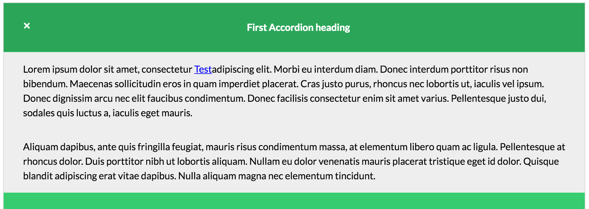
This snippet not only creates an accordion functionality that has animations, but it’s also fully responsive. The accordion tabs smoothly slide down to reveal the content when the heading is clicked. This accordion feature would be a great addition to any website.

2. CSS Text Animation

Screen Shot 2017-03-22 at 9.48.20 AM

This tutorial demonstrates how to use CSS to animate text. The second word rotates in between four different words, so you can use the animation to essentially make your text say four things at once.

3. CSS Animated Hamburger Icon

Screen Shot 2017-03-22 at 9.55.19 AM

The hamburger icon in this snippet turns into an “x” when you click it, thanks to smooth CSS transitions and animations. When you click it again, it reverts back to the three-line hamburger style icon.

4. CSS Flame Animation

Screen Shot 2017-03-22 at 9.58.19 AM

This pure CSS flame animation dances and flickers slightly, just like a real flame would. A really cool effect to add to a project that has a spooky or eerie vibe.

5. Pure CSS Animated Clouds

Screen Shot 2017-03-22 at 10.00.21 AM

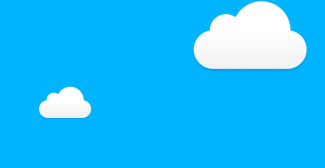
This pure CSS animation produces clouds of all different sizes that slowly float on by from one end of the viewport to the other.

7. CSS3 Working Clock

Screen Shot 2017-03-22 at 10.03.00 AM

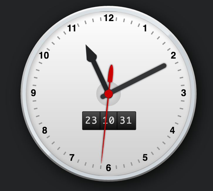
Did you know you can use CSS animations to create a realistic looking working clock? No JavaScript or jQuery necessary. The clock is pure CSS, using only CSS to create all movements and shapes.

8. CSS Animation on Hover

Screen Shot 2017-03-22 at 10.05.05 AM

This simple snippet is a good demonstration of how you can use CSS animations to rotate an object, and also how you can activate CSS animations using :hover as a trigger event.

9. CSS Spinner Animation

Screen Shot 2017-03-22 at 10.07.48 AM

Use this tutorial to understand how to make a pure CSS spinner. Spinners are perfect to present to the users while sites or images are preparing to load.

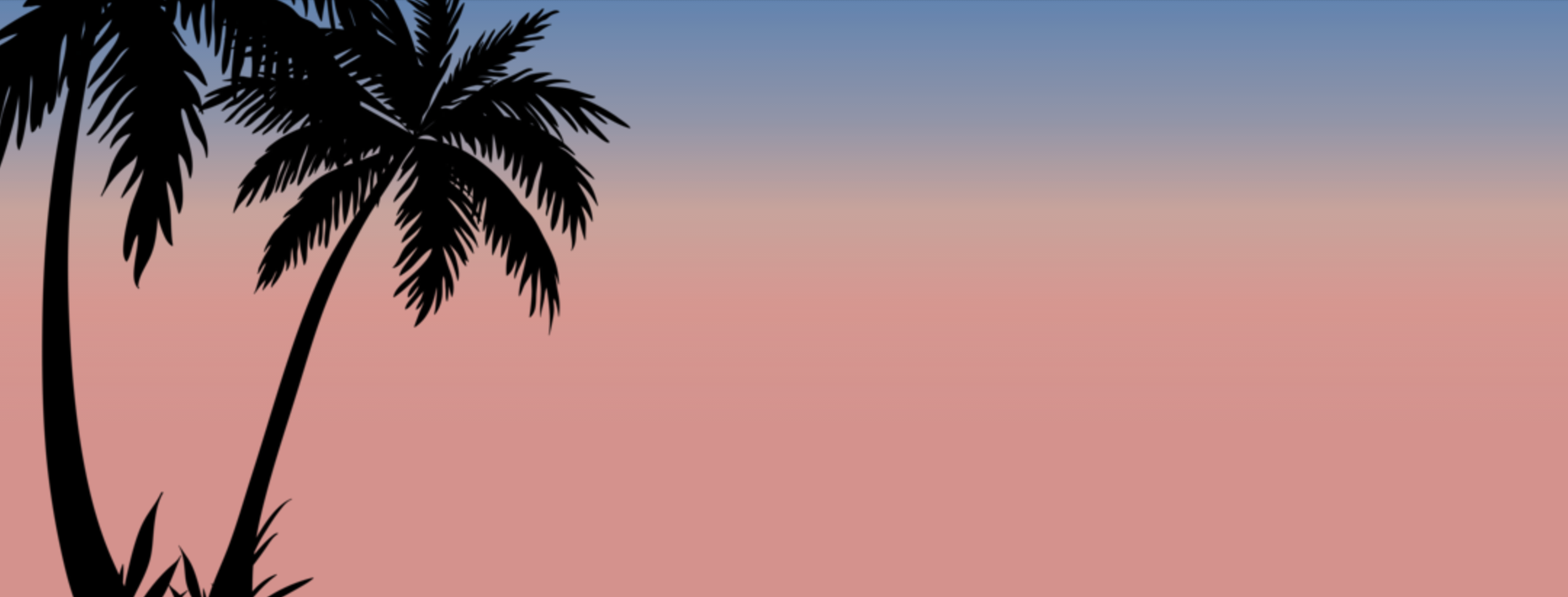
10. CSS Animated Sunset Background

Screen Shot 2017-03-22 at 10.09.37 AM

This snippet uses animated gradients as the background of the page to create a moving sunset type effect. A great way to experiment with animated gradients and color.

How to Create Social Media Share Buttons

A good social media share button has to be aesthetically pleasing and really accessible — you have to make your users want to click the buttons and share your content (a good hover effect with a clean CSS transition never hurt, either). In this tutorial, we’ll show you how to make simple but beautiful social media share buttons using Font Awesome icons that come complete with a smooth hover effect. The best part about this tutorial is that it really requires relatively little code, so it’s a pretty quick and simple way to add a whole lot of style and professionalism to your projects.

The HTML

To start, we’ll need some HTML for our buttons. They’re going to be standard anchor tags that contain icon tags so we can use the social media platform’s logo icon with each corresponding social media share button. Because we’re using Font Awesome, we need to make sure that we link to the icon library somewhere in our files, either by using CSS’s @import rule, or by adding the following code into the <head> of our HTML file:

<link rel="stylesheet" href="https://maxcdn.bootstrapcdn.com/font-awesome/4.5.0/css/font-awesome.min.css">

To create the buttons, your HTML should resemble the following code:

<div class="container">
  <a class="share facebook" href="#">
    <i class="fa fa-facebook"></i> 
    Share
  </a>
 
  <a class="share gplus" href="#">
    <i class="fa fa-google-plus"></i> 
    Share
  </a>
 
  <a class="share twitter" href="#">
    <i class="fa fa-twitter"></i> 
    Tweet
  </a>
 
  <a class="share stumbleupon" href="#">
    <i class="fa fa-stumbleupon"></i> 
    Stumble
  </a>
 
  <a class="share pinterest" href="#">
    <i class="fa fa-pinterest"></i> 
    Pin it
  </a>
 
  <a class="share linkedin" href="#">
    <i class="fa fa-linkedin"></i> 
    LinkedIn
  </a>
</div>

Here, we’re creating share buttons for Facebook, GooglePlus, Twitter, Stumble Upon, Pinterest, and LinkedIn. However, if you want to customize this code for your own projects, feel free to add as many social media platforms as you like — Font Awesome has icons for just about every social media network that has ever been even a little bit popular, so you have a lot of options.

The CSS

Now it’s time to add some major styling to our HTML and turn the plain links into something resembling buttons. Here’s the CSS you’ll need to achieve this:

@import url(https://fonts.googleapis.com/css?family=Ubuntu);

body{
    font-family: 'Ubuntu';
    text-transform: lowercase;
    background-color: #d1e0e0;
}

.container{
    text-align: center;
    width: auto;
    margin: 75px auto;
    width: 55%;
}

.share {
   float: left;
   padding: 10px 15px;
   border: none;
   background-color: #ececec;
   text-decoration: none;
   font-size: 14px;
   color: #FFF;
   z-index: 1;
   transition: transform .1s ease-in;
}

.share i{
    font-size: 18px;
    padding-right: 5px;
}

.facebook {
   background-color: #3b5998;
}
 
.gplus {
   background-color: #dd4b39;
}
 
.twitter {
   background-color: #55acee;
}
 
.stumbleupon {
   background-color: #eb4924;
}
 
.pinterest {
   background-color: #cc2127;
}
 
.linkedin {
   background-color: #0077b5;
}

As you’ll probably notice, the background of each button is a different color, and these colors reflect the logos and brands of the social media platforms that the buttons correspond to. You’re free to customize this code however you like, but if you want your buttons to stay on brand, then you may choose to keep the colors as is.

You also might notice that we added a transition property to the buttons. This will come into play when we add the hover effect, which is our next and final step. Right now, our buttons should look something like this:

Screen Shot 2017-03-02 at 4.12.18 PM

It’s a beautiful sight.

The Hover Effect

We’re almost done, we just need to add one little finishing touch, because what’s a good button without a hover effect? Here, we’ll finalize our social media sharing buttons by giving them an effect that makes the buttons smoothly increase in size (thanks to our transition rule from earlier) when the user hovers over them. This effect sort of makes it look like the buttons are popping out at you, but in a smooth way that makes it quite fun to hover over them.

Here’s the CSS you’ll need:

.share:hover {
   transform: scale(1.3);
   z-index: 2;
}

That’s it. All we need to do is transform the scale and make sure we give the buttons a higher than default z-index (otherwise they will grow in size but won’t show up over the other buttons) and our social media sharing buttons are ready to be included in our projects. Here’s how it looks when you hover over one of them:

Screen Shot 2017-03-02 at 4.12.26 PM

CSS Snippets: How to Create a Print Button

One cool thing about CSS is that there are probably about one hundred different ways to use the styling language to make buttons, and this is probably because there are just so many different types of buttons to be created.

One of the most useful types of buttons you can make is the print button. When giving your user the option to print a page, you can use a boring old text link, OR you can spice things up by creating a beautiful, stylish, colorful button with hover effects. In this tutorial, you’ll learn how to make a cool looking print button that includes a Font Awesome icon for an extra pinch of style.

The HTML

Your HTML is going to be pretty straightforward. First, because we’re using a Font Awesome icon in this tutorial, you’re going to need to link to the Font Awesome library. You can do this either in your CSS using the @import rule, or you can insert the following tag into the <head> of your HTML — it doesn’t really matter which one you choose to do, as long as you don’t forget to do it. For this example, let’s just link to the library from our HTML file:

 <link rel="stylesheet" href="https://maxcdn.bootstrapcdn.com/font-awesome/4.5.0/css/font-awesome.min.css">

The HTML code for your print button should look like this:

 <a href="" class="print"><i class="fa fa-print"></i>Print</a>

Without any styling added to it, this is what your code should look like so far:

Screen Shot 2017-03-01 at 5.05.36 PM

As you can see, the font icon we’re using (in the HTML it’s the <i> tag and we use the class to specify which Font Awesome we’re looking for) is one of a printer, so your user will definitely have no question what this clicking this button is going to do.

Now it’s time to add some style.

The CSS

We want to add some color, some dimension, and some sleekness to this print button. The following code does a fair job at achieving all of that:

@import url(https://fonts.googleapis.com/css?family=Source+Sans+Pro:400,700);

body{
    font-family: 'Source Sans Pro';
    background-color: #e4ecbd;
}

.container{
    width: 400px;
    margin: 0 auto;
}

a.print{
    text-decoration: none;
    display: inline-block;
    width: 75px;
    margin: 20px auto;
    background: #dc143c;
    background: linear-gradient(#e3647e, #DC143C);
    text-align: center;
    color: #fff;
    padding: 3px 6px;
    border-radius: 3px;
    border: 1px solid #e3647e;
}

i.fa.fa-print{
    margin-right: 5px;
}

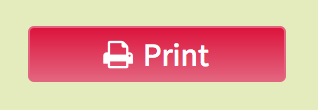
Using only about 30 lines of CSS, we’ve managed to add a whole lot of style to our little text link. Instead of text, it now looks like a real button:

Screen Shot 2017-03-01 at 5.00.33 PM

We use a linear gradient combining two similar colors as the background of the button to give it that 3-Dimensional look so the design isn’t so flat. We also add some subtle border radius values to the button to add some softness to the harsh rectangular shape of the anchor tag. The bright color and the white font also help to really make the button pop and stand out on the light green background.

The only finishing touch we still need is a hover effect.

The Hover Effect

To add a hover effect to your button, add this line of code to the end of the CSS snippet above:

a.print:hover{
    background: linear-gradient(#DC143C, #e3647e)
}

This simple hover trick has a great effect. By swapping the linear gradient values of the background, the print button appears to be almost indented when its hovered upon in comparison to how it looks when the cursor is not over the tag. See the image below to check out the effect:

Screen Shot 2017-03-01 at 5.00.40 PM

This snippet is simple and super easy to implement, but it will really add a smooth, professional feel to any project its added to. A great and quick way to really freshen up your print links or buttons.

How to Create a Striped Text Effect

With CSS3, it’s easier than ever to create cool text effects to add to your projects. CSS allows you to manipulate your text in complex ways so that your text can resemble something that might have been made in a sophisticated software program, like Photoshop or Illustrator.

One fun text effect that can be created somewhat easily is a striped text effect, which gives your text horizontal stripes so that you can make it super colorful. With this effect, you can give one word up to five different colors. If you want to see how to achieve this look for yourself, check out the tutorial below.

The HTML

The HTML in this tutorial is pretty important. You need to make sure you give your h1 tag and your span tag an attribute with a value that we can refer back to later in our CSS. For this example, the attribute we used was called stripes, and the value was “Striped Text.” The attribute can be called anything you like (just make sure that you give the h1 and the span tags the same attributes), but for this code snippet to work, the attribute value must match the text in between the span tags. See the code below for a better understanding of how it should look:

<h1 stripes="Striped Text"><span stripes="Striped Text">Striped Text</span></h1>

As you can see, the attribute for both the h1 tag and the span tag is called stripes, and the value assigned to it is “Striped Text,” which matches the text found within the span tags.

The CSS

The CSS is the fun part. Now is when we get to add some much needed style to our plain old text. We’re going to take advantage of the :before and :after pseudo-selectors of both span and h1 to add the stripe effect to our text, and we’ll use the content and z-index properties to make different layers of the text (that helps creates the stripe illusion) and to be sure that they overlap in the right ways.

html, body {
  background: #536283;
  width: 100%;
  height: 100%;
}

h1 {
  font-family: 'Oswald', sans-serif;
  text-transform: uppercase;
  font-size: 100px;
  text-align: center;
  line-height: 1;
  margin: 0;
  top: 50%;
  left: 50%;
  -webkit-transform: translate(-50%, -50%);
          transform: translate(-50%, -50%);
  position: absolute;
  color: #ff6666;
}
h1:before, h1:after,
h1 span:before,
h1 span:after {
  content: attr(stripes);
  position: absolute;
  overflow: hidden;
  left: 0;
}
h1:before {
  color: #def1f9;
  height: 34%;
  z-index: 5;
}
h1:after {
  color: #f4dce6;
  height: 50%;
  z-index: 4;
}
h1 span:before {
  color: #cdf2c6;
  height: 66%;
  z-index: 3;
}
h1 span:after {
  color: #94e1e3;
  height: 80%;
  z-index: 2;
}

As you can probably tell, the code for achieving this effect isn’t too complicated. By giving h1 and span a :before and :after whose content is the text, we’re creating 5 different layers of the words “Striped Text” that happen to fall right on top of each other. By changing the heights of each of these selectors and pseudo selectors and playing around with the z-index, we make it look as though the text is striped, when actually the effect is created by many layers of the same words stacked on top of each other, each with a different height.

The finished product should look like this:

Screen Shot 2017-03-21 at 9.23.49 AM

Pretty cool, right? As always, the colors can be completely changed and customized. Same goes for the font-size, font-family, and actual words you choose to apply this text effect to.

Top 10 Free Sublime Text Themes

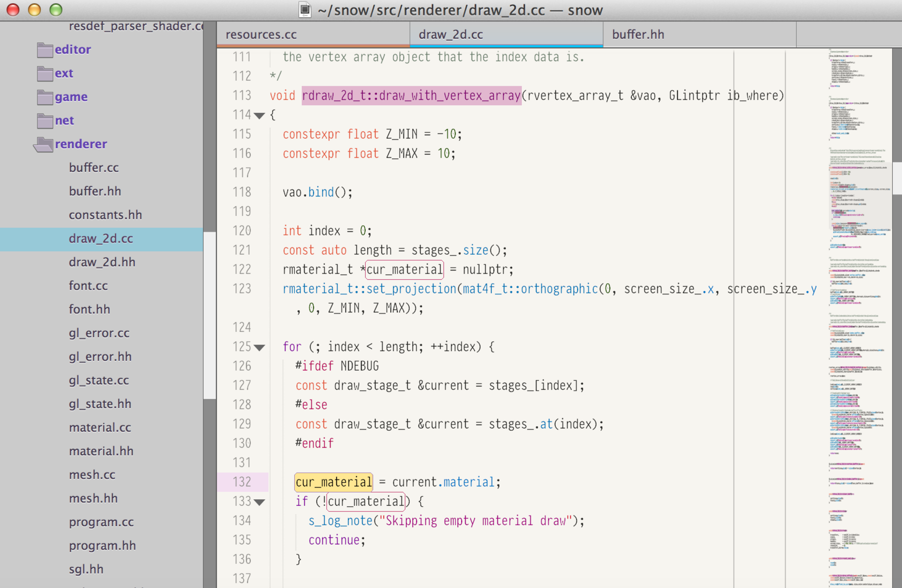
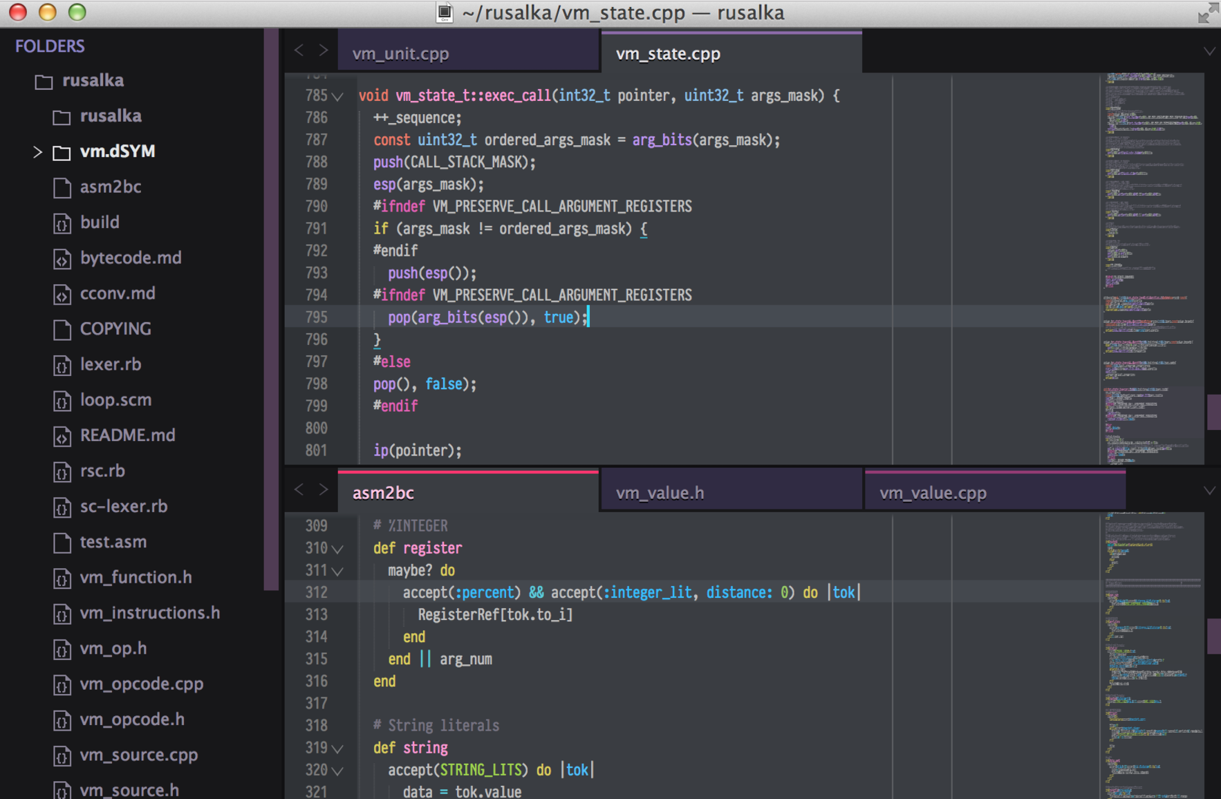
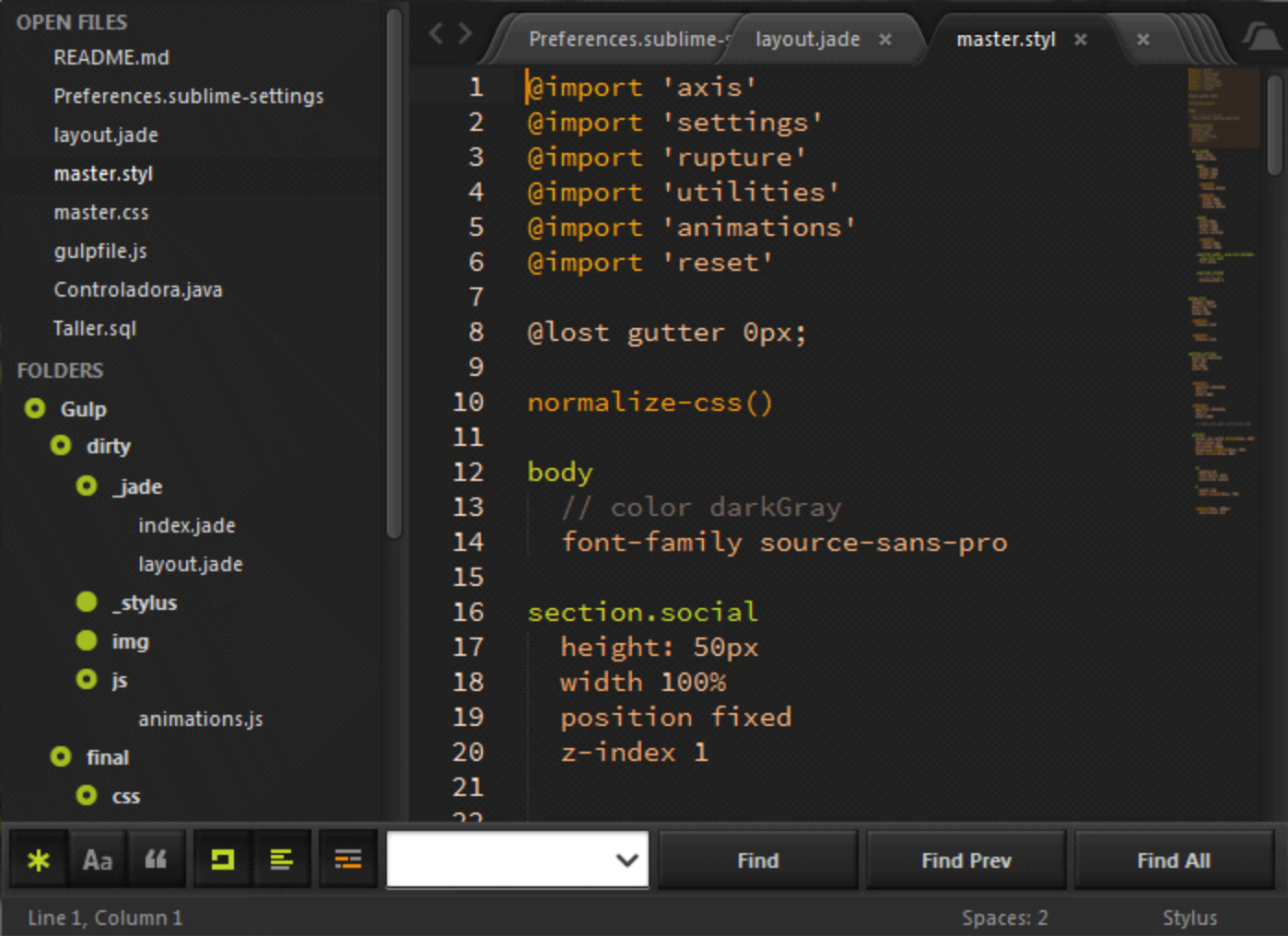
Sublime Text is a popular text editor that’s a favorite of many web developers when it comes to what tool they prefer to use to write their code. One of the many cool features of Sublime Text is that it allows you to totally customize its appearance by adding your own theme to it. This way, you’re really personalizing your coding experience. Another great thing about installing a theme to your text editor is that it can come with features and customizations that you wouldn’t normally get with an out of the box install of Sublime Text. Themes can optimize file trees, fonts, colors, positioning of features, and functionalities. What follows is a list of 10 of the coolest free themes to use to customize your Sublime Text editor.

  1. Night

Screen Shot 2017-03-13 at 12.44.18 PMNight is a cool theme with a more subdued color scheme. Typically, Sublime Text default formatting colors are pretty bright, but Night’s are more dull.

2. Material Theme

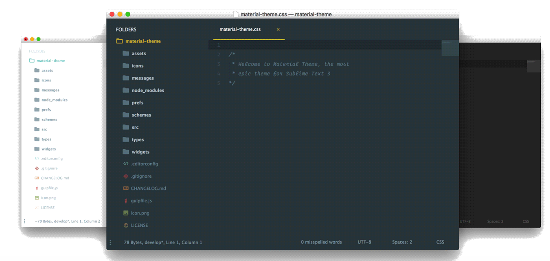
Screen Shot 2017-03-13 at 12.47.41 PMMaterial Theme comes with lots of options for customization. It’s easy to install and activate, and it comes with almost a dozen of color scheme options to apply to your editor.

3. Tech49

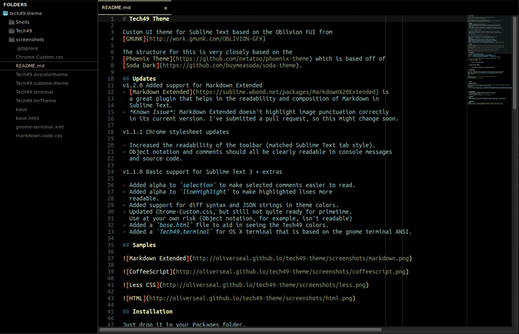
Screen Shot 2017-03-13 at 12.49.36 PMTech49 is a funky theme that adds a lighter color scheme to your Sublime Text text editor. Comes loaded with lots of ways to customize the way you right your code.

4. Agila

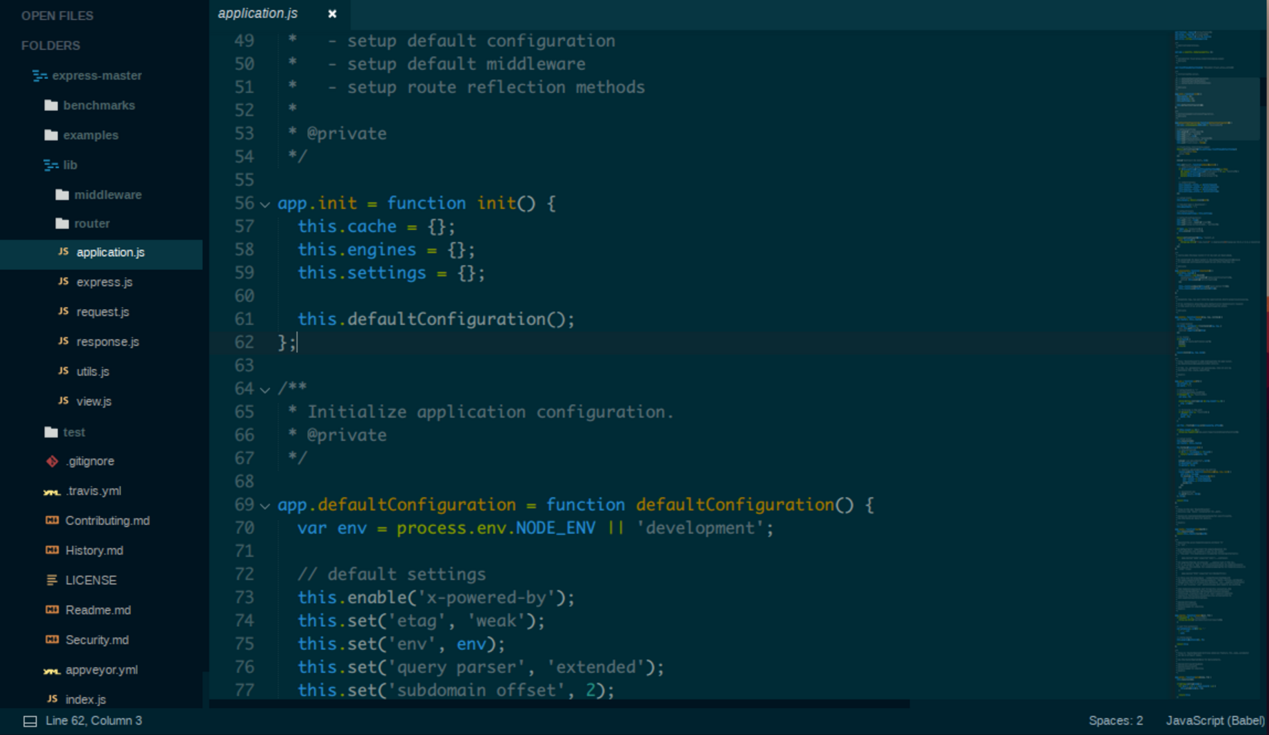
Screen Shot 2017-03-13 at 12.52.20 PMAgila is a colorful, popular text editor with a lot of cool features, one of which is the abundance of spacing between the folders in the file tree for optimum legibility and ease of use.

5. Sunrise

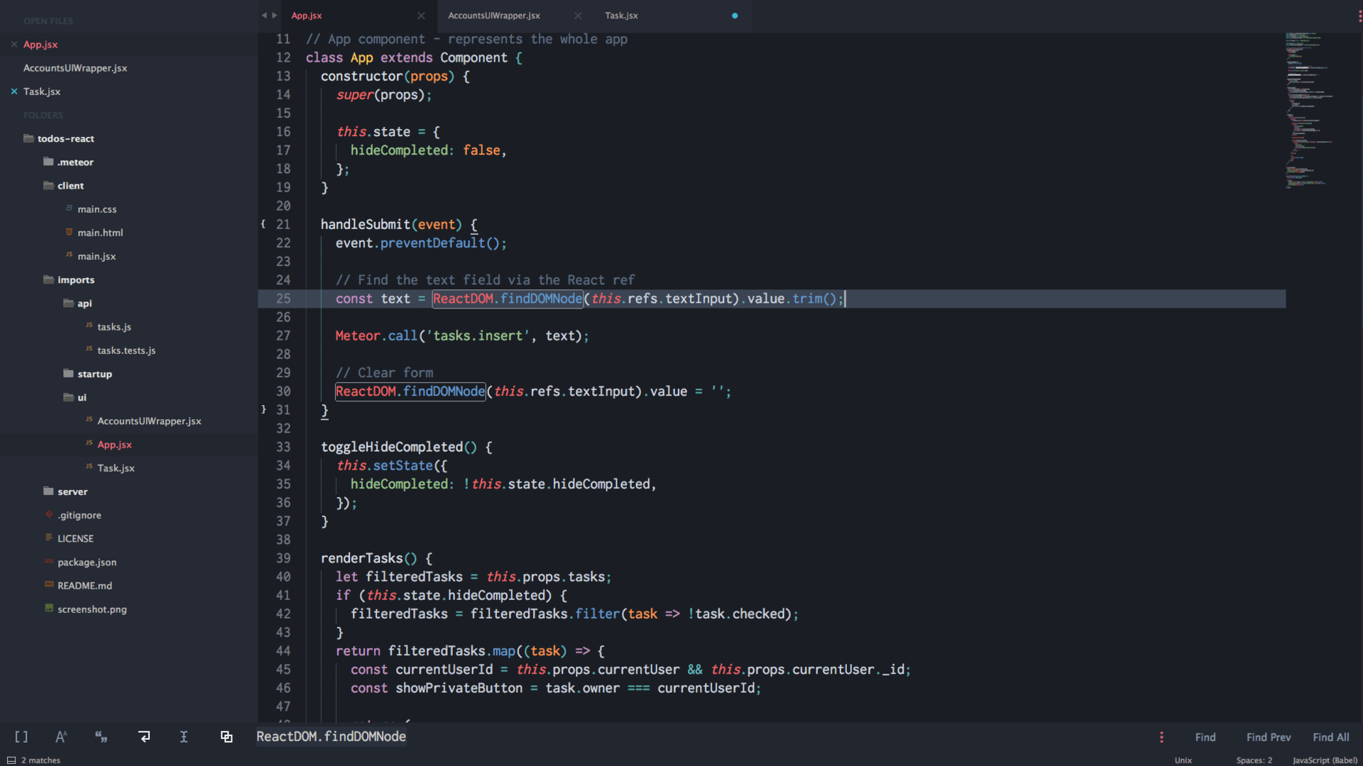
Screen Shot 2017-03-13 at 12.54.43 PMThe sunrise theme has a blue color scheme that adds a unique palette to your text editor. It’s based on the Seti_UI theme and is easy to both install and activate.

6. Nil

Screen Shot 2017-03-13 at 12.57.19 PMNil gives you the option to add a little lightness to your Sublime Text editor. If you choose to apply the light theme to your editor, the background will go from standard black to a lighter cream color. Additionally, the font is different from the standard Sublime Text font, so this theme can be used to really switch things up.

7. Freesia

Screen Shot 2017-03-13 at 12.59.24 PMFreesia is a beautiful pink and purple theme that was no doubt inspired by the colors of the beautiful and delicate flower for which it was named.

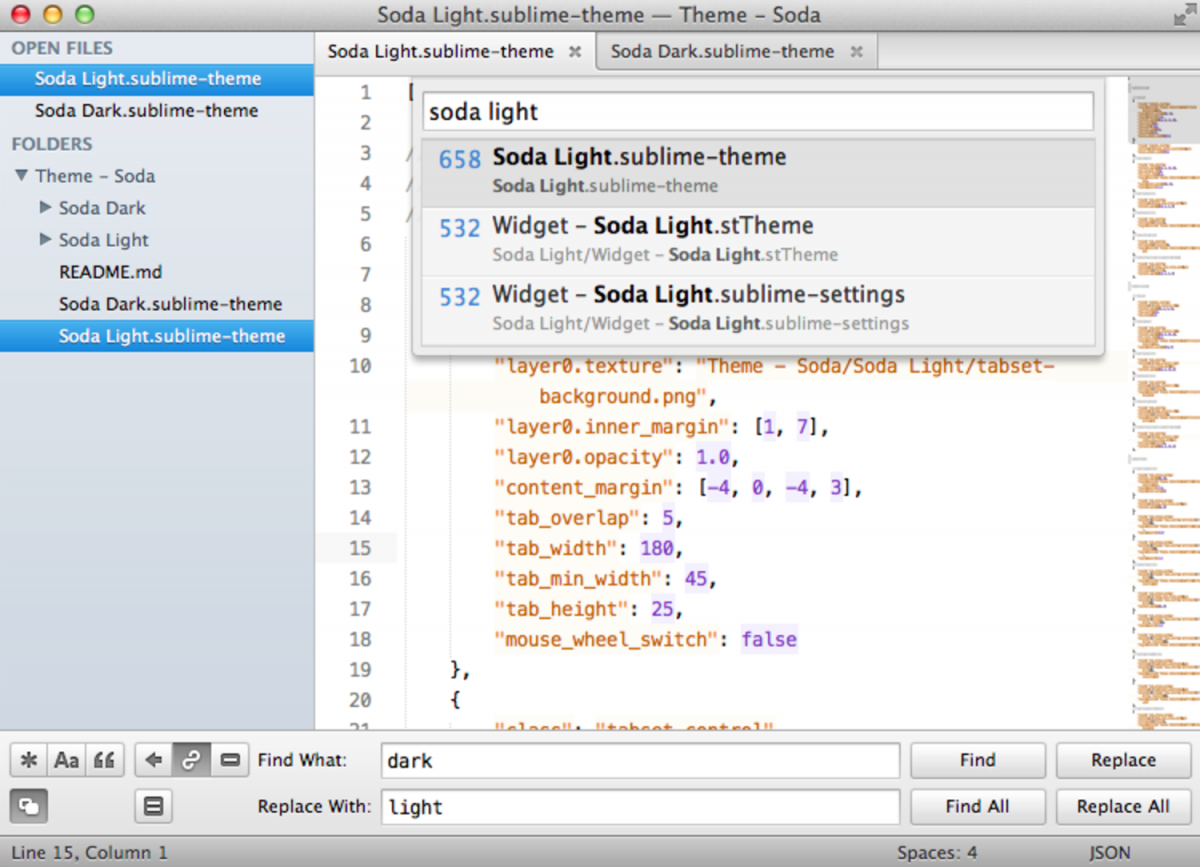
8. Soda

Screen Shot 2017-03-13 at 1.01.18 PMSoda is another theme that gives you the option to add a lighter aesthetic to your text editor. This one will turn the background of your editor from black to white, and change the default color of text from white to black.

9. Autumn

Screen Shot 2017-03-13 at 1.03.49 PMThe Autumn theme offers a unique perspective on the file tree, adding stylized bullet points next to the file names instead of file icons, which is pretty unique among this list of themes.

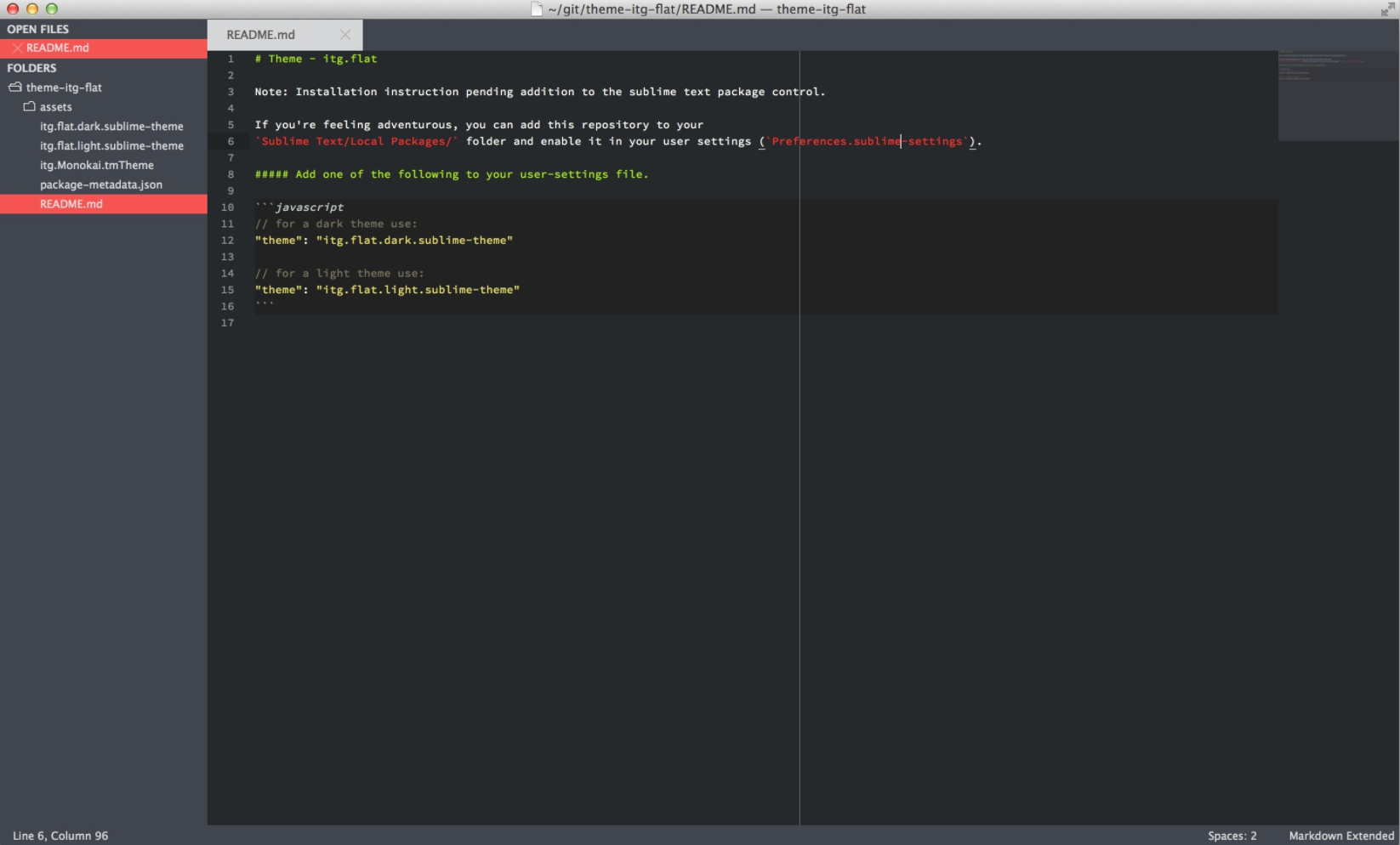
10. itg.flat

Screen Shot 2017-03-13 at 1.05.47 PM

itg.flat is a theme designed for retina displays and inspired by flat design aesthetics. It’s a cool, sleek, and modern looking theme to apply to your text editor, and comes with two different color schemes, dark and light.