Guide to Creating CSS Toggle Switch

This guide will show you exactly the code you’ll need to create a cool toggle switch that sort of resembles the ones used on iOS devices. The toggle switch is interactive, so that when the user clicks on the switch, it actually changes positions (and reveals a color on the toggle bar that signifies whether or not the switch is “active”). The toggle is actually created by adding some serious styling to your average checkbox input HTML tag. To start building this effect, all you really need are a few lines of HTML.

The HTML

<div class="container">
 <input type="checkbox" name="toggle" id="toggle">
 <label for="toggle"></label>
</div>

As you can see, all we really need is a standard input tag to get the ball rolling. The real magic happens when we add the CSS, but make sure you don’t forget to include the label tag! See the CSS below to find out just how handy that label tag becomes.

The CSS

body{
 background-color: #d9d9d9;
}

input#toggle {
 max-height: 0;
 max-width: 0;
 opacity: 0;
}

input#toggle + label {
 display: block;
 position: relative;
 box-shadow: inset 0 0 0px 1px #a6a6a6;
 height: 30px;
 width: 50px;
 border-radius: 15px;
 margin: 100px auto;
 background-color: rgba(255, 255, 255, .3);
}

input#toggle + label:before {
 content: "";
 display: block;
 height: 30px;
 width: 30px;
 top: 0;
 left: 0;
 border-radius: 15px;
 background: rgba(172, 230, 0, 0);
 -moz-transition: .3s ease-in-out;
 -webkit-transition: .3s ease-in-out;
 transition: .3s ease-in-out;
}

input#toggle + label:after {
 content: "";
 position: absolute;
 display: block;
 height: 30px;
 width: 30px;
 top: 0;
 left: 0px;
 border-radius: 15px;
 background: white;
 box-shadow: inset 0 0 0 1px rgba(0, 0, 0, .2), 0 2px 4px rgba(0, 0, 0, .2);
 -moz-transition: .3s ease-in-out;
 -webkit-transition: .3s ease-in-out;
 transition: .3s ease-in-out;
}

input#toggle:checked + label:before {
 width: 50px;
 background: #ace600;
}

input#toggle:checked + label:after {
 left: 20px;
 box-shadow: inset 0 0 0 1px rgba(172, 230, 0, 1), 0 2px 4px rgba(0, 0, 0, .2);
}

One little toggle switch takes about 60 lines of CSS to create, which is quite a lot, but once you see the final effect (image below), you’ll see that it’s totally worth it. Below is an image of the toggle switch in the “off” position.

Screen Shot 2016-11-07 at 5.44.31 PM

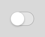
Some things of note in the CSS: the box-shadow property is one that is used often to create that 3D look. The border-radius property is used to give the input tag that oblong, rounded corner shape we’re so used to seeing on our mobile devices. The CSS also makes use of the label input and the :checked, :before and :after pseudo-selectors to create the toggle functionality and control the movements of the rounded “toggle”. See the image below of the toggle in the switched on position (this is the default).

Screen Shot 2016-11-07 at 5.44.24 PM

A Guide to CSS Resets

CSS resets are a great tool that can be used to essentially reset some (or all, depending on the reset you use) of a particular browser’s default styling. Developers use resets to help ensure cross-browser compatibility, and to make it easier to style their HTML elements to match their design specs exactly without any default browser styling getting in the way. As a developer, you can choose to create your own custom reset or use one of the common reset snippets to reset browser styling. You can also modify any reset snippets you find to suit the needs of your projects.

The Universal Reset

This might be the simplest CSS rest of them all. The universal reset is used to set the margin and padding of every HTML element to zero. To use the reset, simply add this code to the top of your stylesheets:

*{
margin: 0;
padding: 0;
}

You’ll often see other properties added to this reset as well, like border: 0 and outline: 0, for example, but feel free too add any property you like. Just be very conscious of the fact that any property used with the * selector will be applied to all your HTML elements.

Eric Meyer’s CSS Reset

This is another common reset snippet that aims to eliminate browser inconsistencies. It’s inclusive of many different (but not all) HTML elements and resets margins, padding, and border values to 0, while also setting alignment to baseline. It also includes resetting rules for blockquotes. See the snippet below:

/* http://meyerweb.com/eric/tools/css/reset/ 
   v2.0 | 20110126
   License: none (public domain)
*/

html, body, div, span, applet, object, iframe,
h1, h2, h3, h4, h5, h6, p, blockquote, pre,
a, abbr, acronym, address, big, cite, code,
del, dfn, em, img, ins, kbd, q, s, samp,
small, strike, strong, sub, sup, tt, var,
b, u, i, center,
dl, dt, dd, ol, ul, li,
fieldset, form, label, legend,
table, caption, tbody, tfoot, thead, tr, th, td,
article, aside, canvas, details, embed, 
figure, figcaption, footer, header, hgroup, 
menu, nav, output, ruby, section, summary,
time, mark, audio, video {
	margin: 0;
	padding: 0;
	border: 0;
	font-size: 100%;
	font: inherit;
	vertical-align: baseline;
}
/* HTML5 display-role reset for older browsers */
article, aside, details, figcaption, figure, 
footer, header, hgroup, menu, nav, section {
	display: block;
}
body {
	line-height: 1;
}
ol, ul {
	list-style: none;
}
blockquote, q {
	quotes: none;
}
blockquote:before, blockquote:after,
q:before, q:after {
	content: '';
	content: none;
}
table {
	border-collapse: collapse;
	border-spacing: 0;
}

HTML5 Doctor’s Reset

The HTML5 Doctor’s Reset is essentially just a modified version of Eric Meyer’s reset, and was modified specifically with HTML5 and the HTML5 boilerplate template in mind. It includes specific resets for many more HTML elements than the Meyer reset, including input, table, hr, and a. This reset is a lot more in-depth than the other two and goes beyond just resetting the default — for many elements it creates a new, almost themed default setting. See the snippet below:

/* 
html5doctor.com Reset Stylesheet
v1.6.1
Last Updated: 2010-09-17
Author: Richard Clark - http://richclarkdesign.com 
Twitter: @rich_clark
*/

html, body, div, span, object, iframe,
h1, h2, h3, h4, h5, h6, p, blockquote, pre,
abbr, address, cite, code,
del, dfn, em, img, ins, kbd, q, samp,
small, strong, sub, sup, var,
b, i,
dl, dt, dd, ol, ul, li,
fieldset, form, label, legend,
table, caption, tbody, tfoot, thead, tr, th, td,
article, aside, canvas, details, figcaption, figure, 
footer, header, hgroup, menu, nav, section, summary,
time, mark, audio, video {
 margin:0;
 padding:0;
 border:0;
 outline:0;
 font-size:100%;
 vertical-align:baseline;
 background:transparent;
}

body {
 line-height:1;
}

article,aside,details,figcaption,figure,
footer,header,hgroup,menu,nav,section { 
 display:block;
}

nav ul {
 list-style:none;
}

blockquote, q {
 quotes:none;
}

blockquote:before, blockquote:after,
q:before, q:after {
 content:'';
 content:none;
}

a {
 margin:0;
 padding:0;
 font-size:100%;
 vertical-align:baseline;
 background:transparent;
}

/* change colours to suit your needs */
ins {
 background-color:#ff9;
 color:#000;
 text-decoration:none;
}

/* change colours to suit your needs */
mark {
 background-color:#ff9;
 color:#000; 
 font-style:italic;
 font-weight:bold;
}

del {
 text-decoration: line-through;
}

abbr[title], dfn[title] {
 border-bottom:1px dotted;
 cursor:help;
}

table {
 border-collapse:collapse;
 border-spacing:0;
}

/* change border colour to suit your needs */
hr {
 display:block;
 height:1px;
 border:0; 
 border-top:1px solid #cccccc;
 margin:1em 0;
 padding:0;
}

input, select {
 vertical-align:middle;
}

Conclusion

Resets can be a great tool to ensure cross-browser compatibility, to get rid of inconsistencies between browsers, and to determine new, custom default styling for your projects. However, resets can be a powerful tool — sometimes too powerful. If you’re not careful, your resets can end up changing the styling of something that you might not have wanted to alter (this is particularly true with the universal reset), so use them with caution.

Lastly, don’t forget that you can modify any rest snippet you like to reflect the needs of your project. The resets are open-source, so don’t be afraid to make changes. And if none of the resets above are really working for you, you can always write your own!


10 Essentials For Using Chrome’s Developer Tools

Google Chrome’s Developer tools makes coding so much easier I’m not sure how developers ever lived without it. For those unfamiliar with it, the tool allows developers to edit their code in real time from their live web browser so they can see exactly how any changes they might make to their code would change or impact their sites. Essentially, it saves developers a lot of frustration when it comes to building, editing and maintaining their products. Developer Tools is generally easy to use and pretty intuitive for any developers, but just in case you missed something, here are our top ten tips for using Developer Tools to its full advantage.

1. The search function

Did you know Developer Tools has a search function that will search through a site’s entire source for you? It’s not immediately obvious that this function exists because there isn’t an easily accessible search bar. To use the functionality, you have to hit CMD + OPT + F (or CTRL + SHIFT + F, for you Windows users), and then you’ll be able to search for anything in the source code. This is great for trying to find those pesky HTML tags that get buried in nested code.

2. You can use the console to select elements

If you don’t want to search, you can also find items by selecting them in the console. Simply insert the element (or class or ID name) you’re looking for within the query selector $$() and all instances of that element will appear for you on the console (just like when using jQuery, be sure to place your element, class, or ID names in quotations or the selection won’t work).

3. Pretty Print

This is a cool feature that can be used when viewing the source code that will format any ugly or disorganized code to make it legible for you. You can find the Pretty Print icon (it looks like two brackets: {}) in the bottom left-hand corner of the editor in the source tab.

4. Color Picker

This is my personal favorite Dev Tool feature. When you select an element with any color attribute, you can actually click on the little color square in the CSS panel to access a color picker, where you can change the color of the element using the built in color picker. Not only does it simplify things, but it’s also pretty fun to play around with (you can also change the color from HEX to RGBA (or vice versa) within this color picker panel too — a super useful trick).

Screen Shot 2016-09-25 at 4.21.07 PM

5. Toggle Element State

At the top of CSS panel there’s a button that says :hov, and if you click on it you’ll be able to toggle the element’s pseudo-selectors :hover, :active, :focus, and :visited, so you can see what the elements look like when all those states are activated. This trick seems to be particularly useful because it can be very difficult to edit how an element looks in it’s active state while not actually being able to activate the element (or access that element’s CSS state rules) because you’re using your cursor within Dev Tools.

6. Preserve Log

You’ll find this one particularly useful if you happen to use the console a lot. By checking “Preserve Log” at the top, your console log will be saved so that you can refresh the page without losing any of your data.

7. Device Toolbar

This one is probably pretty well-known, but just on the off chance that someone is new to Dev Tools, it should be known that dev tools offers an awesome way to view sites as they would appear on a mobile device or tablet (there are even several mobile device and tablet templates you can view). Gone are the days of constantly resizing your browser window and crossing your fingers that it looks the same on an iPhone. To activate the device view, click the icon that looks like a phone next to a tablet in the top left hand corner of the Dev Tools editor.

Screen Shot 2016-09-25 at 4.33.51 PM

8. Edit HTML Elements

You can change the name, get rid of, or otherwise edit any HTML element in the elements console simply my double clicking on the element you wish to change. From there, go ahead and make your changes or delete the element as you wish.

9. Adjust the docking position

It seems like most developers prefer to work with the Dev Tools editor anchored to the bottom of their page, but if you like, you can change the position so that it appears anchored to the right hand side (this is actually the default positioning) or so that Dev Tools pops out as its own window. To toggle the docking position, click the vertical three dots next to the ‘x’ on the right hand side of the screen and select the position that works best for you.

Screen Shot 2016-10-16 at 3.27.51 PM

10. Jump to line

You can jump to a particular line within a file in the source tab by pressing CMD + O (CTRL + O for Windows users) to easily access any part of the file without all that scrolling and searching.


Guide to Creating Pure CSS Animated Buttons

There are so many different ways to create stylish buttons with HTML and CSS. All you need is an <a> tag or two to get started. It’s also fairly easy to create animated buttons that actually appear to push down when they are pressed — this can be done completely with CSS, no jQuery or JavaScript necessary!

Continue reading “Guide to Creating Pure CSS Animated Buttons”

Two Ways to Create an Animated Hamburger Menu

If you’re a developer or a designer, you’re probably familiar with the trend of using hamburger (or three-line) menus as fully responsive and mobile friendly navigation solutions. The trend has grown considerably over time and is becoming even more popular as mobile friendly and mobile first design becomes the norm. In fact, it feels like hamburger menus or three line icons have become a universally recognizes symbol for “navigation menu.” So how do you make yours stand out from the pack? Add some smooth animations, of course! What follows are two different ways to create unique hamburger menus that have animated effects when they’re clicked.

Three Lines to One Line Effect

One cool way to animate your hamburger menu icon is to have the three lines transform into one line when it’s clicked, then have it go back to three lines when it’s clicked again. This can be achieved pretty easily by creating each line of the hamburger menu from HTML and CSS, then creating classes that can be toggled with a jQuery toggle event that will effectively hide the top and bottom menu line when they’re clicked.

Here’s the HTML to start you off:


<div class="icon-group">
<div class="icon"></div>
</div>

As you can see, this icon is created purely from divs. Here’s the CSS you’ll need to use to make those divs look like a three line icon (and to give them some nice style as well!).


.icon-group {
 position: relative;
 width: 65px;
 height: 40px;
 transform: translate(-50%, -50%);
 position: absolute;
 left: 50%;
 top: 50%;
}
.icon-group:hover {
 cursor: pointer;
}

.icon {
 margin-top: 20px;
 position: absolute;
 width: 100%;
 height: 0.5em;
 background: #DB324D;
}
.icon:before, .icon:after {
 position: absolute;
 width: 100%;
 height: 0.5em;
 background: #DB324D;
 transition: margin-top 150ms;
 content: "";
 display: block;
 margin-top: -20px;
}
.icon:after {
 margin-top: 20px;
}

.icon-group.collapsed .icon:before {
 margin-top: 0;
}
.icon-group.collapsed .icon:after {
 margin-top: 0;
}

Your menu icon should now look like this:

Screen Shot 2016-09-23 at 12.40.41 PM

To add the animations, you’ll need to include the following JavaScript:


$(document).ready(function(){
$('.icon-group').on('click', function(){
 $(this).toggleClass('collapsed');
});
});


The code above will toggle the .collapsed class when the .icon-group icon is clicked — this class, when added to the .icon-group div, will actually toggle the top and bottom lines of the icon (this is because of the way we’ve defined them in the CSS — check out .collapsed in the CSS above!). The menu, when clicked, should look like just one line:

Screen Shot 2016-09-23 at 12.40.47 PM


Three Lines to X Effect

Another interesting way to animate your three-line hamburger icon menu is to have the three lines transform into an X when it’s clicked. This can be achieved in almost the same was as the previous effect, by having jQuery toggle a particular class when the menu is clicked. To make the lines appear to cross, all you need to employ is the transform property.

Start by creating the elements of your hamburger three-line menu as HTML elements within an <a> tag.

Then style it using the following CSS so that it actually looks like a three-line menu icon:


.hamburgler {
 width: 300px;
 height: 300px;
 display: block;
 -webkit-transition: .3s ease all;
 transition: .3s ease all;
}
.hamburgler.no-hamburgler {
 -webkit-transform: rotate(-45deg);
 transform: rotate(-45deg);
}

.bun,
.meat {
 display: block;
 width: 100%;
 background: #fcd455;
 height: 20%;
 -webkit-transition: .3s ease all;
 transition: .3s ease all;
 border-radius: 50px;
}

.no-hamburgler .top {
 height: 38%;
 width: 20%;
 margin-left: 40%;
 border-radius: 50px 50px 0 0;
}

.no-hamburgler .bottom {
 height: 38%;
 width: 20%;
 margin-left: 40%;
 border-radius: 0 0 50px 50px;
}

.meat {
 margin: 20% 0;
}
.no-hamburgler .meat {
 margin: 2% 0;
}

Your three-line hamburger menu should look like this:

Screen Shot 2016-09-23 at 5.19.05 PM

Use the following JavaScript code to make sure your icon forms an X when it’s clicked:


$(document).ready(function() {
 $('.hamburgler').click(function(e) {
 e.preventDefault();
 $(this).toggleClass('no-hamburgler');
 });


Screen Shot 2016-09-23 at 5.19.11 PM

Make sure you include the e.preventDefault(); function or the hamburgler menu will act as a regular link when you click it and could potentially reload the page.

Adding these animations to your hamburger menu icons can really make your icons stand out. In a world where practically everyone is implementing hamburger menus in their designs, it definitely doesn’t hurt to stand out a bit.


HTML5 Fullscreen Background Video with CSS and JS (Plugin/Library)

Fullscreen background videos that autoplay right when the webpage loads (above the fold) has become quite a popular trend these days. Personally I think a fullscreen good quality video that autoplays does increases engagement for the users/customers. It should be kept in mind that the story of the video must be relevant to the brand. These days we’re surrounded by loads of videos on social networks like FB and Twitter as well which autoplay (but is muted of course). Analytical studies have also reported higher engagement due to this.

Continue reading “HTML5 Fullscreen Background Video with CSS and JS (Plugin/Library)”

Getting Started with React – Setting up the Development Environment

React (also React.js or ReactJS) is a JavaScript library for building user interfaces developed by Facebook & Instagram. It is not a full blown framework like Angular or Ember or even Backbone.js. It is a very simple View library which can replace the V in any other client-side MVC framework, i.e., you can use Backbone and React together for instance. In fact a lot of people are already doing that. Although when combined with a design pattern like Flux, you can totally give up on an MVC framework for your client-side architecture and happily develop apps with just React in conjunction with the Flux application architecture. React encompasses some interesting concepts too like Virtual DOM, uni-directional reactive data flow, etc. but don’t worry we’ll discuss all those much later when you’re already comfortable with the library and hacking your way through it.

Continue reading “Getting Started with React – Setting up the Development Environment”