
Fixed headers are an increasingly popular trend for styling headers or navigation menus on your site. When you add a fixed header to a page, that means that the position of the header stays fixed (usually to the top of the page, but it doesn’t necessarily have to be positioned as such) no matter how far the user scrolls down the page. This feature is helpful for anyone who wants to make sure their users always have access to particular links or navigation no matter which part of the page they may be exploring.
If you think that adding a fixed header to any of your projects might be a good idea or, at the very least, a fun experiment, you’re in luck, because it’s actually pretty easy to do. Keep reading and we’ll walk you through the basic steps.
The HTML
For a very, very basic fixed header structure, we used something like this:
What's the one thing every developer wants? More screens! Enhance your coding experience with an external monitor to increase screen real estate.
<body>

<div class="header">
 <h1 class="header_logo">This is a Fixed Header</h1>
</div>
<div class="offset">
 <p>Scroll down to see the responsive header in action.</p>
</div>

</body>
It’s totally up to you what you want to include in your header. It could be navigation, links, a phone number or other contact info…the choice is completely yours. For the purposes of this demonstration, we just chose to include some text indicating that what you’re looking at is, in fact, a fixed header, and some content below that so we have something to scroll past.
The CSS
We wanted our fixed header to be purple, but the color choice and style of your header is totally up to you. The only line of CSS you absolutely can’t do without if you want the header to be fixed is position: fixed, which in our code is applied to the .header selector. The size, color, positioning, padding, font-family, and pretty much everything else can be tailored to the needs of your project or site.
Check out the CSS below:
body {
 height: 1500px;
 font-family: "Montserrat";
}

.offset {
 margin-top: 0;
 padding-top: 270px;
 text-align: center;
 -webkit-transition: .3s;
 transition: .3s;
}

.header {
 position: fixed;
 width: 100%;
 height: 100px;
 font-weight: bold;
 text-align: center;
 background: #7F6FF0;
 -webkit-transition: .3s;
 transition: .3s;
 color: #fff;
}

.header_logo {
 font-family: 'Oswald', sans-serif;
 margin: 0;
 padding-top: 8px;
 font-size: 30px;
 text-shadow: 3px 4px rgba(0, 0, 0, 0.1);
 -webkit-transition: .3s;
 transition: .3s;
}
If you use the code above, this is how your fixed header should look:
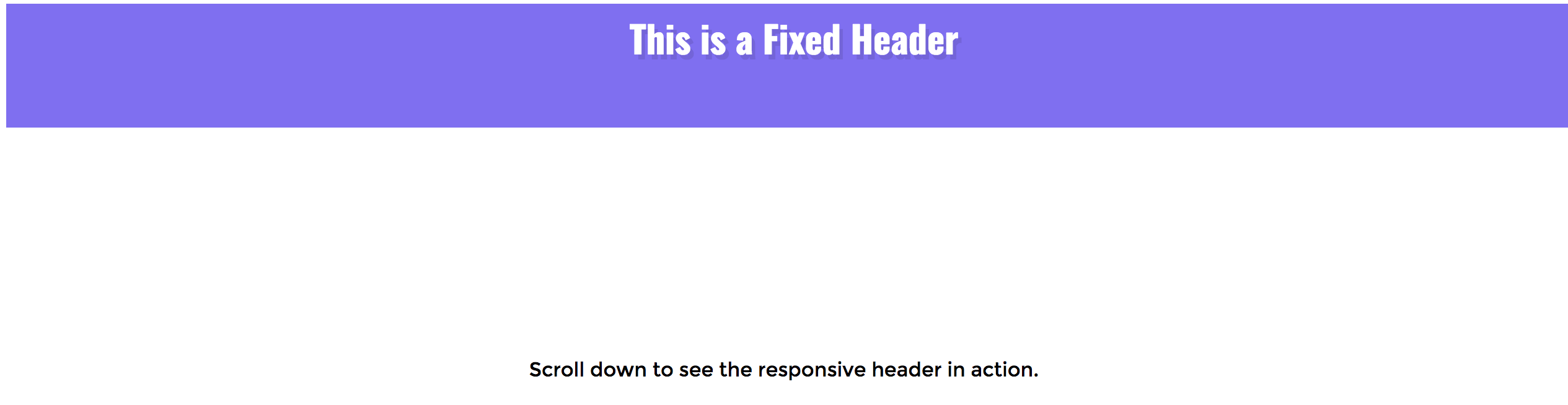
While you can’t really appreciate the whole fixed header effect from just a screenshot, trust us when we say that when you scroll down this page , you will scroll past the text and end up with the header still stuck to the to of the page. Add the code to any of your projects to see it in action for yourself!