
A good social media share button has to be aesthetically pleasing and really accessible — you have to make your users want to click the buttons and share your content (a good hover effect with a clean CSS transition never hurt, either). In this tutorial, we’ll show you how to make simple but beautiful social media share buttons using Font Awesome icons that come complete with a smooth hover effect. The best part about this tutorial is that it really requires relatively little code, so it’s a pretty quick and simple way to add a whole lot of style and professionalism to your projects.
The HTML
To start, we’ll need some HTML for our buttons. They’re going to be standard anchor tags that contain icon tags so we can use the social media platform’s logo icon with each corresponding social media share button. Because we’re using Font Awesome, we need to make sure that we link to the icon library somewhere in our files, either by using CSS’s @import rule, or by adding the following code into the <head> of our HTML file:
<link rel="stylesheet" href="https://maxcdn.bootstrapcdn.com/font-awesome/4.5.0/css/font-awesome.min.css">
To create the buttons, your HTML should resemble the following code:
What's the one thing every developer wants? More screens! Enhance your coding experience with an external monitor to increase screen real estate.
<div class="container">
  <a class="share facebook" href="#">
    <i class="fa fa-facebook"></i>
    Share
  </a>

  <a class="share gplus" href="#">
    <i class="fa fa-google-plus"></i>
    Share
  </a>

  <a class="share twitter" href="#">
    <i class="fa fa-twitter"></i>
    Tweet
  </a>

  <a class="share stumbleupon" href="#">
    <i class="fa fa-stumbleupon"></i>
    Stumble
  </a>

  <a class="share pinterest" href="#">
    <i class="fa fa-pinterest"></i>
    Pin it
  </a>

  <a class="share linkedin" href="#">
    <i class="fa fa-linkedin"></i>
    LinkedIn
  </a>
</div>
Here, we’re creating share buttons for Facebook, GooglePlus, Twitter, Stumble Upon, Pinterest, and LinkedIn. However, if you want to customize this code for your own projects, feel free to add as many social media platforms as you like — Font Awesome has icons for just about every social media network that has ever been even a little bit popular, so you have a lot of options.
The CSS
Now it’s time to add some major styling to our HTML and turn the plain links into something resembling buttons. Here’s the CSS you’ll need to achieve this:
@import url(https://fonts.googleapis.com/css?family=Ubuntu);

body{
    font-family: 'Ubuntu';
    text-transform: lowercase;
    background-color: #d1e0e0;
}

.container{
    text-align: center;
    width: auto;
    margin: 75px auto;
    width: 55%;
}

.share {
   float: left;
   padding: 10px 15px;
   border: none;
   background-color: #ececec;
   text-decoration: none;
   font-size: 14px;
   color: #FFF;
   z-index: 1;
   transition: transform .1s ease-in;
}

.share i{
    font-size: 18px;
    padding-right: 5px;
}

.facebook {
   background-color: #3b5998;
}

.gplus {
   background-color: #dd4b39;
}

.twitter {
   background-color: #55acee;
}

.stumbleupon {
   background-color: #eb4924;
}

.pinterest {
   background-color: #cc2127;
}

.linkedin {
   background-color: #0077b5;
}
As you’ll probably notice, the background of each button is a different color, and these colors reflect the logos and brands of the social media platforms that the buttons correspond to. You’re free to customize this code however you like, but if you want your buttons to stay on brand, then you may choose to keep the colors as is.
You also might notice that we added a transition property to the buttons. This will come into play when we add the hover effect, which is our next and final step. Right now, our buttons should look something like this:
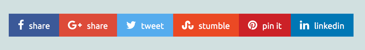
It’s a beautiful sight.
The Hover Effect
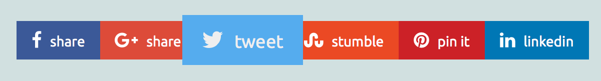
We’re almost done, we just need to add one little finishing touch, because what’s a good button without a hover effect? Here, we’ll finalize our social media sharing buttons by giving them an effect that makes the buttons smoothly increase in size (thanks to our transition rule from earlier) when the user hovers over them. This effect sort of makes it look like the buttons are popping out at you, but in a smooth way that makes it quite fun to hover over them.
Here’s the CSS you’ll need:
.share:hover {
   transform: scale(1.3);
   z-index: 2;
}
That’s it. All we need to do is transform the scale and make sure we give the buttons a higher than default z-index (otherwise they will grow in size but won’t show up over the other buttons) and our social media sharing buttons are ready to be included in our projects. Here’s how it looks when you hover over one of them: