
With CSS3, it’s easier than ever to create cool text effects to add to your projects. CSS allows you to manipulate your text in complex ways so that your text can resemble something that might have been made in a sophisticated software program, like Photoshop or Illustrator.
One fun text effect that can be created somewhat easily is a striped text effect, which gives your text horizontal stripes so that you can make it super colorful. With this effect, you can give one word up to five different colors. If you want to see how to achieve this look for yourself, check out the tutorial below.
The HTML
The HTML in this tutorial is pretty important. You need to make sure you give your h1 tag and your span tag an attribute with a value that we can refer back to later in our CSS. For this example, the attribute we used was called stripes, and the value was “Striped Text.” The attribute can be called anything you like (just make sure that you give the h1 and the span tags the same attributes), but for this code snippet to work, the attribute value must match the text in between the span tags. See the code below for a better understanding of how it should look:
What's the one thing every developer wants? More screens! Enhance your coding experience with an external monitor to increase screen real estate.
<h1 stripes="Striped Text"><span stripes="Striped Text">Striped Text</span></h1>
As you can see, the attribute for both the h1 tag and the span tag is called stripes, and the value assigned to it is “Striped Text,” which matches the text found within the span tags.
The CSS
The CSS is the fun part. Now is when we get to add some much needed style to our plain old text. We’re going to take advantage of the :before and :after pseudo-selectors of both span and h1 to add the stripe effect to our text, and we’ll use the content and z-index properties to make different layers of the text (that helps creates the stripe illusion) and to be sure that they overlap in the right ways.
html, body {
  background: #536283;
  width: 100%;
  height: 100%;
}

h1 {
  font-family: 'Oswald', sans-serif;
  text-transform: uppercase;
  font-size: 100px;
  text-align: center;
  line-height: 1;
  margin: 0;
  top: 50%;
  left: 50%;
  -webkit-transform: translate(-50%, -50%);
          transform: translate(-50%, -50%);
  position: absolute;
  color: #ff6666;
}
h1:before, h1:after,
h1 span:before,
h1 span:after {
  content: attr(stripes);
  position: absolute;
  overflow: hidden;
  left: 0;
}
h1:before {
  color: #def1f9;
  height: 34%;
  z-index: 5;
}
h1:after {
  color: #f4dce6;
  height: 50%;
  z-index: 4;
}
h1 span:before {
  color: #cdf2c6;
  height: 66%;
  z-index: 3;
}
h1 span:after {
  color: #94e1e3;
  height: 80%;
  z-index: 2;
}
As you can probably tell, the code for achieving this effect isn’t too complicated. By giving h1 and span a :before and :after whose content is the text, we’re creating 5 different layers of the words “Striped Text” that happen to fall right on top of each other. By changing the heights of each of these selectors and pseudo selectors and playing around with the z-index, we make it look as though the text is striped, when actually the effect is created by many layers of the same words stacked on top of each other, each with a different height.
The finished product should look like this:
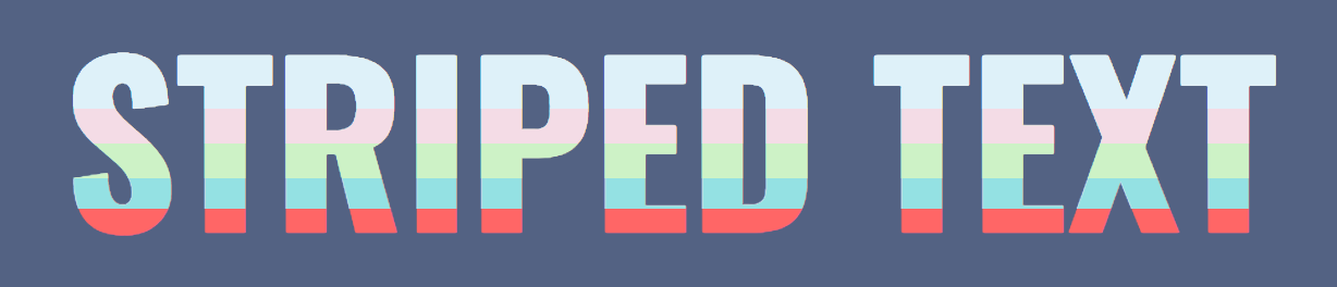
Pretty cool, right? As always, the colors can be completely changed and customized. Same goes for the font-size, font-family, and actual words you choose to apply this text effect to.