Adding AMP Support to WordPress Sites

The Accelerated Mobile Pages (AMP) Project is one of the latest initiatives by developed by Google to enhance the quality of mobile browsing. AMPs are an open-source framework developed with a goal of making mobile web pages quicker to load, more lightweight, and simpler in terms of both design and code.

The reason AMP pages are so much quicker and simpler than standard web pages is that they’re limited to certain libraries and functionalities. Only a certain set of HTML tags are allowed to appear in AMPS, and this also applies to CSS and jQuery. In fact, AMP pages draw from their own streamlined CSS and JS libraries to make sure that the code is as lightweight as possible.

Additionally, AMP pages are cached in the cloud to significantly reduce page load time and let users access their desired content almost immediately. The benefits of using AMP for your sites also go beyound giving your users a better UX on mobile, because it can also improve your search ranking — sites that use AMP are also more likely to be ranked higher on a Google search executed by a mobile device. Setting up AMP on your sites from scratch can be confusing and time-consuming, but if you’ve got a WordPress site, the install couldn’t be easier when using any of the following plugins:

AMP

Screen Shot 2016-11-14 at 3.27.58 PM

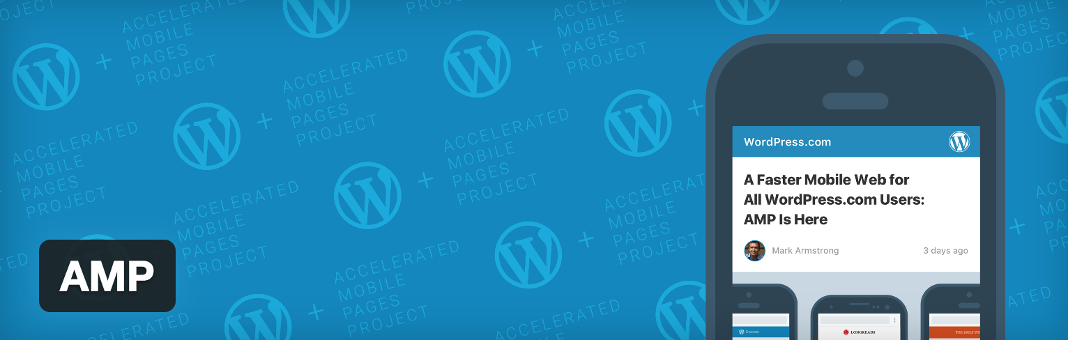
This plugin was developed by the people over at Automattic and is incredibly easy to use. Once it’s installed, it’s pretty much ready to go. To see the AMPs, you just need to install the plugin and then view any post with “/amp” appended to the end of the URL, so for example: www.mysite.com/mypost/amp. Once you view the page, you’ll see that the page has a clean design, the main focus of the page is the content, and that, of course, it’s quick to load.

AMP for WP – Accelerated Mobile Pages

Screen Shot 2016-11-14 at 3.33.28 PM

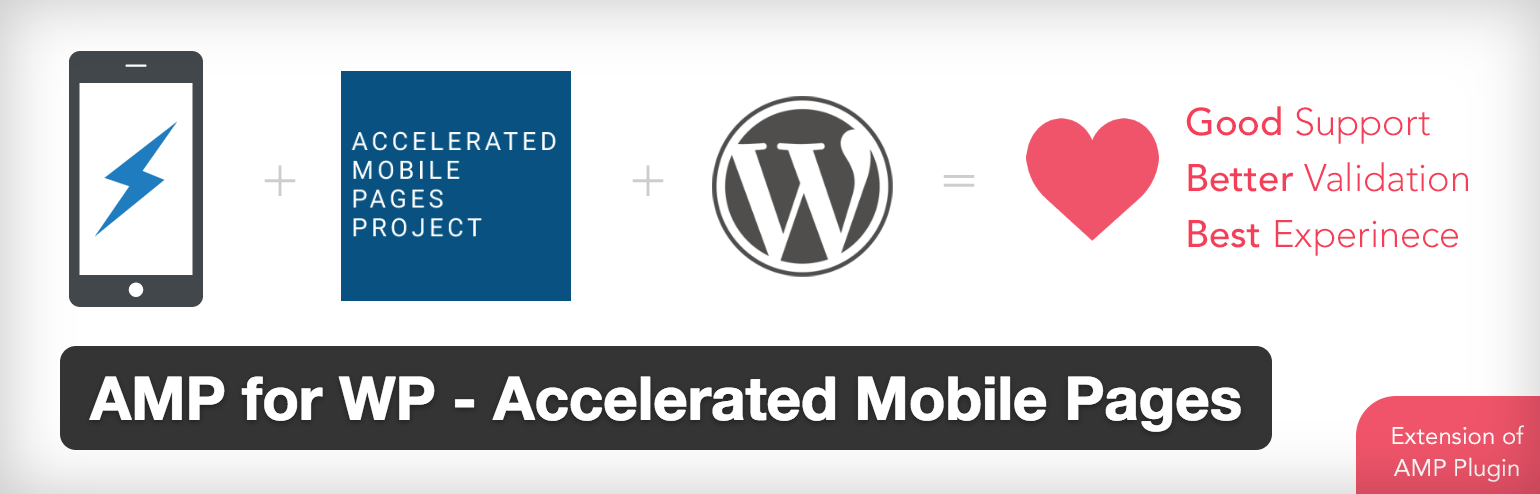
AMP for WP is a similar to the AMP plugin above, but with support for a few more WordPress features. This plugin has support for related posts, recent comments, Google AdSense, Google Analytics, color scheme customizations, social sharing buttons, social media embed support, and more. This plugin is a great option for those who want to benefit from using AMP without compromising too much of their site’s functionality, style, ad revenue, etc.

Facebook Instant Articles & Google Accelerated Mobile Pages by PageFrog

Screen Shot 2016-11-14 at 3.43.17 PM

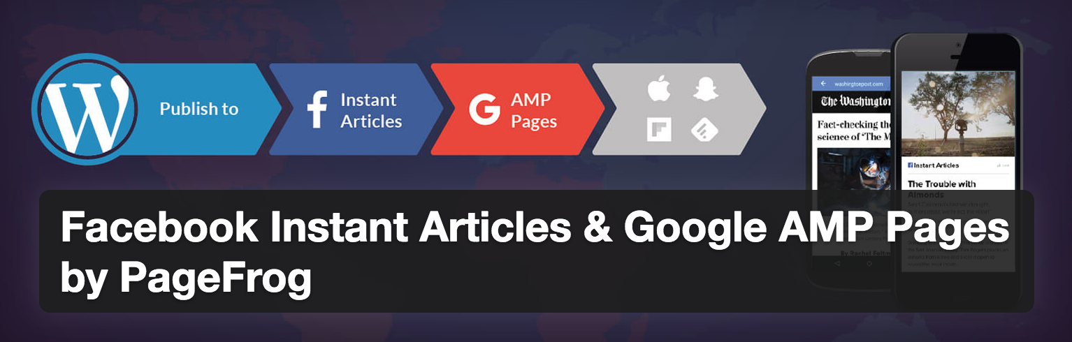
This PageFrog Plugin is another popular plugin that will convert your posts into AMP format. A bonus of using this plugin is that it will also make your posts compatible with Facebook Instant Articles (FBIA), which is content that can be served to users from within Facebook’s mobile app, so if a user clicks on your link from within Facebook’s mobile app, they won’t be brought to an external browser, but can actually view your post within Facebook’s app. This plugin also gives you control over styling, branding, and theme customization, and allows you to run ads on the AMP and FBIA pages as well.


Guide to Creating CSS Toggle Switch

This guide will show you exactly the code you’ll need to create a cool toggle switch that sort of resembles the ones used on iOS devices. The toggle switch is interactive, so that when the user clicks on the switch, it actually changes positions (and reveals a color on the toggle bar that signifies whether or not the switch is “active”). The toggle is actually created by adding some serious styling to your average checkbox input HTML tag. To start building this effect, all you really need are a few lines of HTML.

The HTML

<div class="container">
 <input type="checkbox" name="toggle" id="toggle">
 <label for="toggle"></label>
</div>

As you can see, all we really need is a standard input tag to get the ball rolling. The real magic happens when we add the CSS, but make sure you don’t forget to include the label tag! See the CSS below to find out just how handy that label tag becomes.

The CSS

body{
 background-color: #d9d9d9;
}

input#toggle {
 max-height: 0;
 max-width: 0;
 opacity: 0;
}

input#toggle + label {
 display: block;
 position: relative;
 box-shadow: inset 0 0 0px 1px #a6a6a6;
 height: 30px;
 width: 50px;
 border-radius: 15px;
 margin: 100px auto;
 background-color: rgba(255, 255, 255, .3);
}

input#toggle + label:before {
 content: "";
 display: block;
 height: 30px;
 width: 30px;
 top: 0;
 left: 0;
 border-radius: 15px;
 background: rgba(172, 230, 0, 0);
 -moz-transition: .3s ease-in-out;
 -webkit-transition: .3s ease-in-out;
 transition: .3s ease-in-out;
}

input#toggle + label:after {
 content: "";
 position: absolute;
 display: block;
 height: 30px;
 width: 30px;
 top: 0;
 left: 0px;
 border-radius: 15px;
 background: white;
 box-shadow: inset 0 0 0 1px rgba(0, 0, 0, .2), 0 2px 4px rgba(0, 0, 0, .2);
 -moz-transition: .3s ease-in-out;
 -webkit-transition: .3s ease-in-out;
 transition: .3s ease-in-out;
}

input#toggle:checked + label:before {
 width: 50px;
 background: #ace600;
}

input#toggle:checked + label:after {
 left: 20px;
 box-shadow: inset 0 0 0 1px rgba(172, 230, 0, 1), 0 2px 4px rgba(0, 0, 0, .2);
}

One little toggle switch takes about 60 lines of CSS to create, which is quite a lot, but once you see the final effect (image below), you’ll see that it’s totally worth it. Below is an image of the toggle switch in the “off” position.

Screen Shot 2016-11-07 at 5.44.31 PM

Some things of note in the CSS: the box-shadow property is one that is used often to create that 3D look. The border-radius property is used to give the input tag that oblong, rounded corner shape we’re so used to seeing on our mobile devices. The CSS also makes use of the label input and the :checked, :before and :after pseudo-selectors to create the toggle functionality and control the movements of the rounded “toggle”. See the image below of the toggle in the switched on position (this is the default).

Screen Shot 2016-11-07 at 5.44.24 PM

Best Mobile Analytics Solutions

Analytics are important, not only for tracking the amount of people visiting your site, but also to track their behavior once they’re on it. For mobile apps and mobile sites, popular analytic tools like Google Analytics don’t always work as well tracking behavior of app users as they do tracking the behavior of users on a desktop site. If you really want to analyze the behavior of your app users, you need to use analytic resources built specifically for mobile apps and sites. Take a look at the list below to see some of the best.

Flurry Analytics

flurry

Flurry Analytics can be used to easily and conveniently track the performance of your iOS and Android apps. You can track users’ actions and behaviors in order to learn about trends. It also gives you access to your users’ demographics and interests so as to really give you a feel for who your users are and what sort of content they may be interested in.

Countly

Screen Shot 2016-11-01 at 5.32.04 PM

Countly is a mobile app analytics tool that supports apps on iOS, Android, Windows Phone, and Blackberry. It features an easy to use dashboard and some great options for tracking and user interaction, including access to the habits and session details of your users, and the ability to interact with them using push notifications. Countly also gives you access to crash reports for all different OS builds of your apps, AND it allows you to track the effectiveness of your social media campaigns.

Localytics

Screen Shot 2016-11-01 at 5.44.00 PM

Localytics provides real-time analytics for your mobile apps, in addition to targeted, personalized messaging options for your users and marketing engagement and campaign tracking features. They also offer different pricing packages to scale with the size of your business.

Amplitude

Screen Shot 2016-11-01 at 5.49.49 PM

Amplitude lets you easily track user behavior across platforms so that you can easily compare behaviors on web, tablet, and mobile versions of your sites and applications. Amplitude also offers free options for using their service, as well as paid elite and enterprise options.

Answers

Screen Shot 2016-11-01 at 6.05.54 PM

Answers is a mobile app analytics platform that supports iOS and Android apps. The premise of the platform is that they give you the “answers” you’re looking for — performance metrics, user history and interests, trends — without you having to wade through a lot of data to figure out all of the “answers” on your own.


Best Resources to Learn to Code for Free

If you’ve ever wanted to learn how to code (or maybe you know some basics, but would like to learn more), now’s the time to do it. There are dozens of free code classes and bootcamp-type courses available to accommodate all levels and all schedules so that you can learn at your own pace. Whether you’ve never coded before in your life, or you’re an experienced coder looking to brush up their skills or learn a new language, there’s a good, free code course resource out there for you. Take a look at the list of free coding resources below to see if there’s something that suits you!

Free Code Camp

Free Code Camp is a unique resource in that it doesn’t just offer free code lessons, but it also allows its “students” to use their newly-acquired coding skills to work on real projects for non-profit organizations. Not only do you learn valuable coding skills, but you also get to start creating a portfolio that can be really helpful to you if your ultimate goal is to get a job in web development.

Codecademy

Codecademy is one of the most popular free coding resources, and has free interactive courses for several different languages, including HTML & CSS, JavaScript & jQuery, Python, Ruby, and PHP. In addition to teaching the fundamentals of these popular languages, they also offer courses in practical things, like website deployment, how to use Git, how to use SQL, how to learn Angular and Sass, etc. This resource is a great one for someone who’s interested in learning to code and wants to learn a little to see if it’s right for them.

Coursera

Coursera lets you take free coding classes from actual accredited schools and universities (schools like Hopkins, Duke, and Wesleyan, just to name a few, are among some of the ones offering free coding and computer science courses). While you will have to pay for some of the more advanced classes, it’s still a great research to receive some top notch education for free.

Udemy

Udemy is an online learning platform that offers over 40,000 courses in many different subjects, including coding and web development. Like Coursera, you’ll have to pay for some of the courses (especially the non-introductory ones), but if you’re looking to get a solid education in web development languages, this is the place to go.

HTML5 Rocks

HTML5 Rocks is a Google project that offers free tutorials and resources tailored to people who want to learn about code and tech. This site is an awesome resource for people who are already interested in web development or already know a little code, but are striving to learn more and be better informed.

Khan Academy

Like Udemy, Khan Academy offers courses in a variety of subjects, but their computer programming courses are known to be quite good. You can use Khan’s courses to teach yourself the basics of coding languages, and then you can also choose to take more advanced courses that will show you how to use the fundamentals to create projects to add to your portfolio.

Code Avengers

Code Avengers helps you to learn code interactively by letting you create web applications while learning new languages. When you’re done, you can add the projects to your portfolio to show off your skills and your coding knowledge.

edabit

Learn to code with interactive challenges. Gain XP, unlock achievements and climb the leaderboard. Edabit goes beyond basic syntax and teaches its users how to think like real programmers, so they can finally start making things.


A Guide to CSS Resets

CSS resets are a great tool that can be used to essentially reset some (or all, depending on the reset you use) of a particular browser’s default styling. Developers use resets to help ensure cross-browser compatibility, and to make it easier to style their HTML elements to match their design specs exactly without any default browser styling getting in the way. As a developer, you can choose to create your own custom reset or use one of the common reset snippets to reset browser styling. You can also modify any reset snippets you find to suit the needs of your projects.

The Universal Reset

This might be the simplest CSS rest of them all. The universal reset is used to set the margin and padding of every HTML element to zero. To use the reset, simply add this code to the top of your stylesheets:

*{
margin: 0;
padding: 0;
}

You’ll often see other properties added to this reset as well, like border: 0 and outline: 0, for example, but feel free too add any property you like. Just be very conscious of the fact that any property used with the * selector will be applied to all your HTML elements.

Eric Meyer’s CSS Reset

This is another common reset snippet that aims to eliminate browser inconsistencies. It’s inclusive of many different (but not all) HTML elements and resets margins, padding, and border values to 0, while also setting alignment to baseline. It also includes resetting rules for blockquotes. See the snippet below:

/* http://meyerweb.com/eric/tools/css/reset/ 
   v2.0 | 20110126
   License: none (public domain)
*/

html, body, div, span, applet, object, iframe,
h1, h2, h3, h4, h5, h6, p, blockquote, pre,
a, abbr, acronym, address, big, cite, code,
del, dfn, em, img, ins, kbd, q, s, samp,
small, strike, strong, sub, sup, tt, var,
b, u, i, center,
dl, dt, dd, ol, ul, li,
fieldset, form, label, legend,
table, caption, tbody, tfoot, thead, tr, th, td,
article, aside, canvas, details, embed, 
figure, figcaption, footer, header, hgroup, 
menu, nav, output, ruby, section, summary,
time, mark, audio, video {
	margin: 0;
	padding: 0;
	border: 0;
	font-size: 100%;
	font: inherit;
	vertical-align: baseline;
}
/* HTML5 display-role reset for older browsers */
article, aside, details, figcaption, figure, 
footer, header, hgroup, menu, nav, section {
	display: block;
}
body {
	line-height: 1;
}
ol, ul {
	list-style: none;
}
blockquote, q {
	quotes: none;
}
blockquote:before, blockquote:after,
q:before, q:after {
	content: '';
	content: none;
}
table {
	border-collapse: collapse;
	border-spacing: 0;
}

HTML5 Doctor’s Reset

The HTML5 Doctor’s Reset is essentially just a modified version of Eric Meyer’s reset, and was modified specifically with HTML5 and the HTML5 boilerplate template in mind. It includes specific resets for many more HTML elements than the Meyer reset, including input, table, hr, and a. This reset is a lot more in-depth than the other two and goes beyond just resetting the default — for many elements it creates a new, almost themed default setting. See the snippet below:

/* 
html5doctor.com Reset Stylesheet
v1.6.1
Last Updated: 2010-09-17
Author: Richard Clark - http://richclarkdesign.com 
Twitter: @rich_clark
*/

html, body, div, span, object, iframe,
h1, h2, h3, h4, h5, h6, p, blockquote, pre,
abbr, address, cite, code,
del, dfn, em, img, ins, kbd, q, samp,
small, strong, sub, sup, var,
b, i,
dl, dt, dd, ol, ul, li,
fieldset, form, label, legend,
table, caption, tbody, tfoot, thead, tr, th, td,
article, aside, canvas, details, figcaption, figure, 
footer, header, hgroup, menu, nav, section, summary,
time, mark, audio, video {
 margin:0;
 padding:0;
 border:0;
 outline:0;
 font-size:100%;
 vertical-align:baseline;
 background:transparent;
}

body {
 line-height:1;
}

article,aside,details,figcaption,figure,
footer,header,hgroup,menu,nav,section { 
 display:block;
}

nav ul {
 list-style:none;
}

blockquote, q {
 quotes:none;
}

blockquote:before, blockquote:after,
q:before, q:after {
 content:'';
 content:none;
}

a {
 margin:0;
 padding:0;
 font-size:100%;
 vertical-align:baseline;
 background:transparent;
}

/* change colours to suit your needs */
ins {
 background-color:#ff9;
 color:#000;
 text-decoration:none;
}

/* change colours to suit your needs */
mark {
 background-color:#ff9;
 color:#000; 
 font-style:italic;
 font-weight:bold;
}

del {
 text-decoration: line-through;
}

abbr[title], dfn[title] {
 border-bottom:1px dotted;
 cursor:help;
}

table {
 border-collapse:collapse;
 border-spacing:0;
}

/* change border colour to suit your needs */
hr {
 display:block;
 height:1px;
 border:0; 
 border-top:1px solid #cccccc;
 margin:1em 0;
 padding:0;
}

input, select {
 vertical-align:middle;
}

Conclusion

Resets can be a great tool to ensure cross-browser compatibility, to get rid of inconsistencies between browsers, and to determine new, custom default styling for your projects. However, resets can be a powerful tool — sometimes too powerful. If you’re not careful, your resets can end up changing the styling of something that you might not have wanted to alter (this is particularly true with the universal reset), so use them with caution.

Lastly, don’t forget that you can modify any rest snippet you like to reflect the needs of your project. The resets are open-source, so don’t be afraid to make changes. And if none of the resets above are really working for you, you can always write your own!


10 Essentials For Using Chrome’s Developer Tools

Google Chrome’s Developer tools makes coding so much easier I’m not sure how developers ever lived without it. For those unfamiliar with it, the tool allows developers to edit their code in real time from their live web browser so they can see exactly how any changes they might make to their code would change or impact their sites. Essentially, it saves developers a lot of frustration when it comes to building, editing and maintaining their products. Developer Tools is generally easy to use and pretty intuitive for any developers, but just in case you missed something, here are our top ten tips for using Developer Tools to its full advantage.

1. The search function

Did you know Developer Tools has a search function that will search through a site’s entire source for you? It’s not immediately obvious that this function exists because there isn’t an easily accessible search bar. To use the functionality, you have to hit CMD + OPT + F (or CTRL + SHIFT + F, for you Windows users), and then you’ll be able to search for anything in the source code. This is great for trying to find those pesky HTML tags that get buried in nested code.

2. You can use the console to select elements

If you don’t want to search, you can also find items by selecting them in the console. Simply insert the element (or class or ID name) you’re looking for within the query selector $$() and all instances of that element will appear for you on the console (just like when using jQuery, be sure to place your element, class, or ID names in quotations or the selection won’t work).

3. Pretty Print

This is a cool feature that can be used when viewing the source code that will format any ugly or disorganized code to make it legible for you. You can find the Pretty Print icon (it looks like two brackets: {}) in the bottom left-hand corner of the editor in the source tab.

4. Color Picker

This is my personal favorite Dev Tool feature. When you select an element with any color attribute, you can actually click on the little color square in the CSS panel to access a color picker, where you can change the color of the element using the built in color picker. Not only does it simplify things, but it’s also pretty fun to play around with (you can also change the color from HEX to RGBA (or vice versa) within this color picker panel too — a super useful trick).

Screen Shot 2016-09-25 at 4.21.07 PM

5. Toggle Element State

At the top of CSS panel there’s a button that says :hov, and if you click on it you’ll be able to toggle the element’s pseudo-selectors :hover, :active, :focus, and :visited, so you can see what the elements look like when all those states are activated. This trick seems to be particularly useful because it can be very difficult to edit how an element looks in it’s active state while not actually being able to activate the element (or access that element’s CSS state rules) because you’re using your cursor within Dev Tools.

6. Preserve Log

You’ll find this one particularly useful if you happen to use the console a lot. By checking “Preserve Log” at the top, your console log will be saved so that you can refresh the page without losing any of your data.

7. Device Toolbar

This one is probably pretty well-known, but just on the off chance that someone is new to Dev Tools, it should be known that dev tools offers an awesome way to view sites as they would appear on a mobile device or tablet (there are even several mobile device and tablet templates you can view). Gone are the days of constantly resizing your browser window and crossing your fingers that it looks the same on an iPhone. To activate the device view, click the icon that looks like a phone next to a tablet in the top left hand corner of the Dev Tools editor.

Screen Shot 2016-09-25 at 4.33.51 PM

8. Edit HTML Elements

You can change the name, get rid of, or otherwise edit any HTML element in the elements console simply my double clicking on the element you wish to change. From there, go ahead and make your changes or delete the element as you wish.

9. Adjust the docking position

It seems like most developers prefer to work with the Dev Tools editor anchored to the bottom of their page, but if you like, you can change the position so that it appears anchored to the right hand side (this is actually the default positioning) or so that Dev Tools pops out as its own window. To toggle the docking position, click the vertical three dots next to the ‘x’ on the right hand side of the screen and select the position that works best for you.

Screen Shot 2016-10-16 at 3.27.51 PM

10. Jump to line

You can jump to a particular line within a file in the source tab by pressing CMD + O (CTRL + O for Windows users) to easily access any part of the file without all that scrolling and searching.


Guide to Creating Pure CSS Animated Buttons

There are so many different ways to create stylish buttons with HTML and CSS. All you need is an <a> tag or two to get started. It’s also fairly easy to create animated buttons that actually appear to push down when they are pressed — this can be done completely with CSS, no jQuery or JavaScript necessary!

Continue reading “Guide to Creating Pure CSS Animated Buttons”